
Too narrow material list
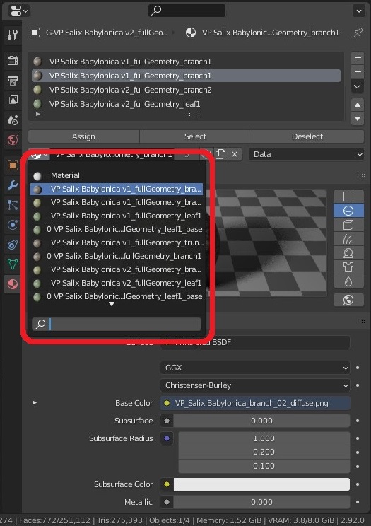
Currently, when you want to choose a material, and expand the list of materials in material properties (see the screenshot), it has fixed width, no matter how wide the properties editor is. This makes it very hard to inspect materials with long names.
To me this is the worst element of Blender's UI.
I think that the width of the material list/ picker (you name it), should be coded as percentage (e.g. 70%) of editor (in this case: properties editor) width, so we could stretch the whole editor whenever we need more space for previewing material names.
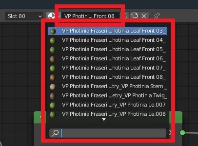
The same problem is with Image Editor and Shader Editor. When you expand the image/ materials list, you cannot see their full names if they're too long.
EDIT:
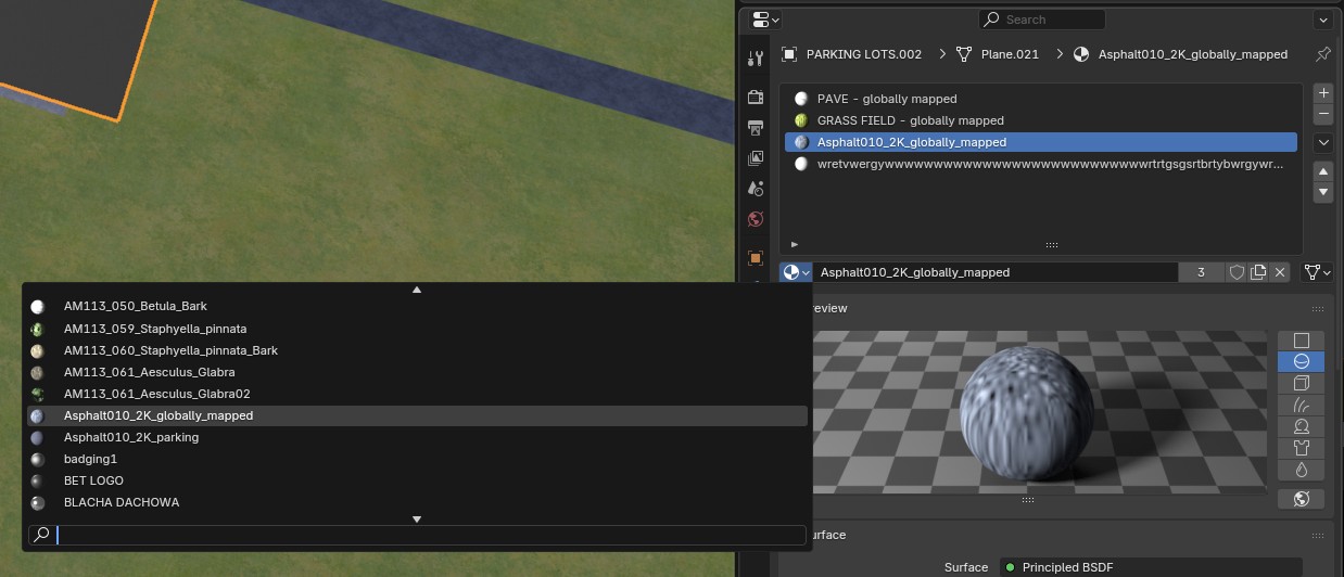
It's been fixed in Blender 4.5. Now the material list drop-down expands horizontally based on the longest name of an existing material, yay!
Same for other editors that feature similar drop-down lists of resources.
8 Comments
Post this in papercuts too.
devtalk.blender.org/t/too-narrow-material-list/20930
Maybe at least running line under mouse cursor?
Actually, when you hover your cursor over material name, the newest Blender will display its full name after a second, but for me it's not enough. I need to see all full names immediately and compare them.
Real issue comes in scenes with dozens of materials with samilar long names/duplicates (often archvis case). Point each material to get full name hint to guess which one you need - helpful addition, but will not work with dozens of such materials.
Better to have some extendable wideness if window size allow it and/or some horizontal slider if names is wider than menu, but menu can't go wider (then user also may slide left/right by MMB, same as it work with other sliders in Blender).
Any fix to this? This and other lists like image ones are too small. How to make the m wider. This is ridiculously inconvenient to scroll such smal list, and there is not even a scroll bar to help scrolling.
It's fixed now. Also, now you can use CTRL+MMB (press and move mouse forward/backward, do not scroll) to regulate UI scale for a specific editor (properties, outliner etc.). Super cool!
This needs to be fixed for sure, we are using blended materials (one material combining multiple ones and blended using vertex paint), so the name has to contain all of them. Because of the fixed width of the picker we can't see which material we are selecting, so hovering the mouse and checking the name in tooltip is necessary... which is pretty time consuming and irritating. I don't understand why such elementary feature like rezisable (or auto-width) list hasn't been implemented already.