
play controls also on the graph editor bar
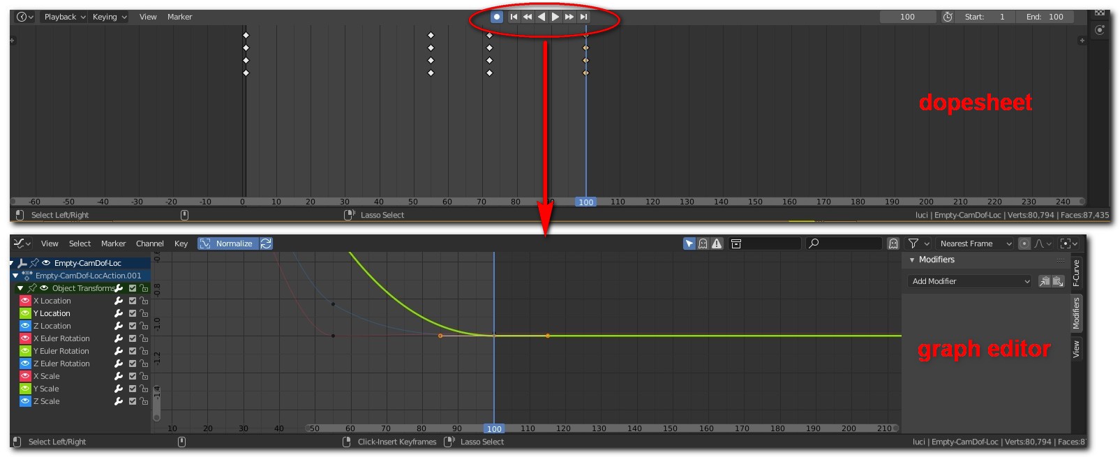
I think that it would be very convenient to have the play commands that are present in the timeline and in the dopesheet also on the graph editor bar. This way you could manage the animation using a single window
6 Comments
Take a look at the default Animation workspace. It has the time line shown as just its header at the bottom. What's wrong with how it is now? I think it works fine enough like that.
If you try to fit those buttons on the Graph Editor to get rid of the Timeline entirely then you'll have to also find space for the start and end frames at the very least. This would make the Graph Editor's header more "stuffed" and you'll have to scroll horizontally on it if you open that editor in a narrower window when trying to reach the other menus.
Isn't the Timeline's whole point to be used as just a header that has those controls? Think about it, if you have multiple Dope Sheets and Graph Editors open, do you really need playback controls on every single one of them? I think it would be a huge waste of space. The way it is now, as a single header down under is elegant enough.
the problem with that is that you have to bring timeline window over and over again if you have your own window setup
That would be nice, having to create a new window just for playback controls could be avoided.
ops! there is my mistake. In the image there is not the dopesheet but the timeline. However, the meaning is understood: add the video controls also in the graph editor
6 years later and these type of small yet extremely meaningful UX issues are never taken into account nor even recognized by the devs. I would like to know what is the reason not including the timeline controls in the graph editor? Blender devs rely too heavily on keyboard shortcuts and completely ignore who use their software, i.e artists not programmers or mathematicians. Every thing in this software is a UX nightmare going against every industry standard. Even overwriting files don't give you a warning, just a red highlight over the file name (i mean really? what's wrong with an overwrite warning like EVERY software created in the last 40 years or so? this is the exact logic of the devs, absolutely none). There are tons of other examples of how this software is completely idiotic in terms of UI/UX but the blender devs NEVER EVER listen because they think they know better. Again I would like to know the reason why not include the timeline controls? why do I need to add another window just for the controls that take more screen realestate than needed? why 6 years later the most basic of UX logic is not addressed? this should have been a thing in 2.8 we are now at 4.3 and still the devs make everything in this software needlessly complicated. I just don't get it
I would like to see also frame controls along with play buttons in every animation editor