
Better Custom Properties field width
I am using Blender 3.4.0 on Debian.
In a project I'm working on, I use a lot of Custom Properties. They do their job just fine, but their presence creates a significant UI annoyance: their fields are all far too wide for their contents, and they just get ever wider as their respective areas of the layout get wider, taking up space that could be used to show the Properties' names:
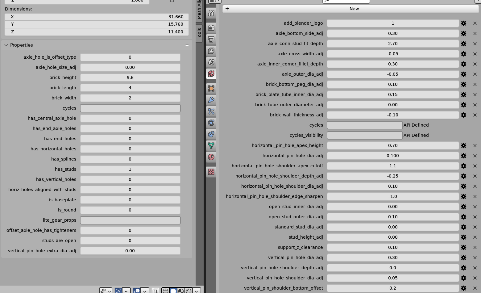
In this screenshot, I have the "N" Sidebar and the rightmost pane both sized just wide enough for Blender to show the full Property names (i.e. to avoid that "..." abbreviation thing). Sizing the layout this big was necessary for this particular image, as it's one of the screenshots published with my project, meant to show all of the project's settings.
As you can see, Blender displays the fields WAY bigger than even their Property names, wasting a ton of horizontal screen space. In fact, the Sidebar and right pane together take up approximately three-fifths of the width of the window when it is maximized, if I size them big enough to show the full Property names, and this is a rather big screen (2560x1440).
I suggest that all of the fields in a given group of Custom Properties just be sized to fit the longest displayed value in any one of them, plus one digit worth of padding on either side. The fields should only grow in width beyond this size if all of the Properties' names in the group can be shown without abbreviation.
That is to say, don't waste screen space on a humongous field widget if you aren't displaying the full name of the Property next to it.
Here is a mock-up of how I think it should look, with the Sidebar and right panes shrunk as narrow as possible while displaying both the fields at the size I suggested, and the full Property names:
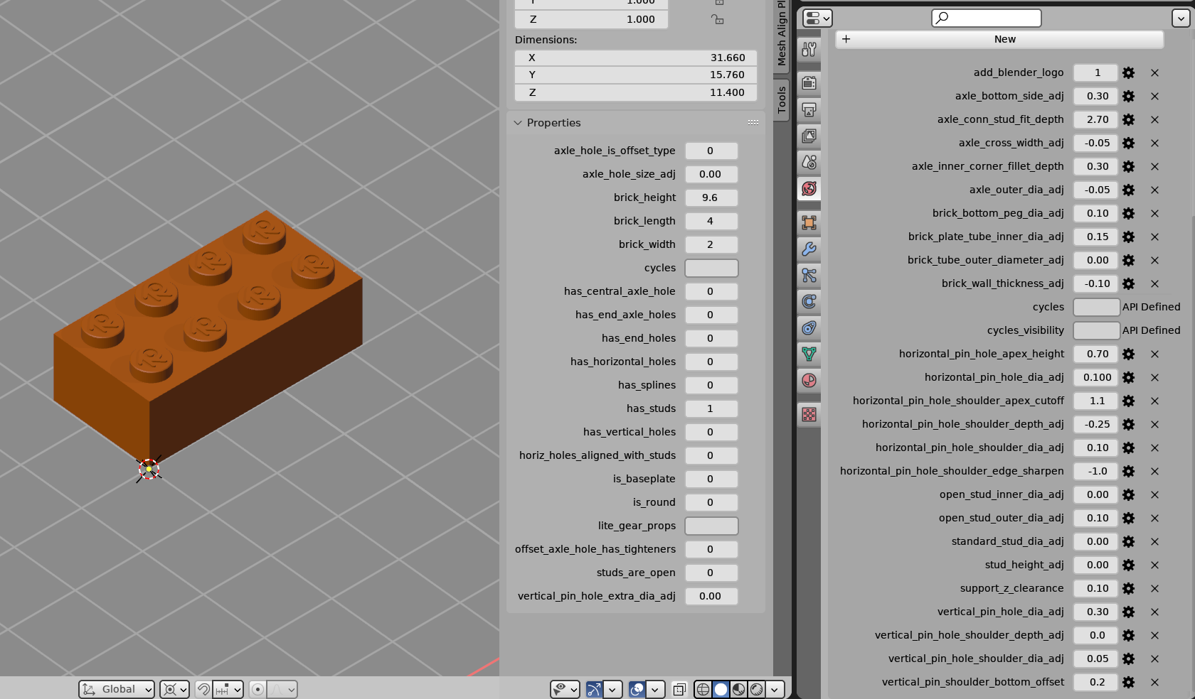
It's an approximation, but it gets the point across. I kept the image dimensions exactly the same in this mock-up as in the actual screenshot, so you can also see just how much more of the actual viewport the user would have to work with.
As you can see, there is also some wasted space between the values in the Sidebar and the tabs area right of them, and the right pane could be further reduced in width if you move the column of "X" icons closer to the column of gear icons, and hide the "API defined" fields, or at least shrink the wording to, say, "API def" (they can't even be copied, let alone edited, so they shouldn't even be shown imho).
0 Comments