
Change checkbox alignment on panel headers
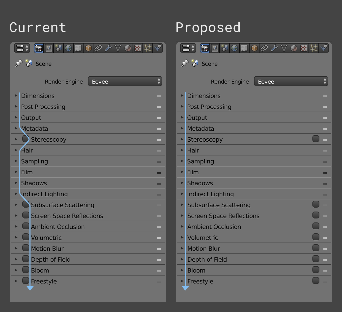
Currently, all panel headers are aligned to the left. Some panels have the ability to have their content enabled or disabled using a checkbox.
However, the checkbox is being displayed to the left of the panel title, pushing it to the right and making the readability difficult.
A simple way of solving this without redesigning the whole enable/disable content feature is to simply realign the checkboxes to the right.
16 Comments
what about this? I think the right side is a better place to put animation key checkbox (if there is any in the future). It could be round in shape and red color if you set a key,
@1to3fall5: I like that too.
@1to3fall5: This is much more comfortable and ergonomic.
@1to3fall5: I liked that too! In fact, I made a version using this logic, but the gap between the arrow and the text really bothers me.
@hperticarati: Yes that's exactly the problem with UI design. Not everyone is going to be happy with some decisions. As I posted below if you keep them at the bottom it doesn't look bad at all. There are tons of things they could tweak but I am sure someone will bring it up at some point to be changed again. Just not sure this is important enough for them to spend time on with so many things to do.
@1to3fall5: like this the most!
Another thing I thought is that having all the tabs that have boxes gathered at the bottom it doesn't look as bad and they are much more organized with the current system. I mean the Stereoscopy makes it worse and it can be even worse if you move them around. Afterall I think it looks good enough for me.
@luisburdallo: Lovely.
Would not it be easier to hide them? If you display the cochable list of effects in "Post Processing" panel, just like for cycle passes, you only display the panels you need. This makes the display more clean. And that removes the problem of check box. Sorry for the translation...
@valentinwn: Since they are implementing subpanels now, that could actually work!
I really agree with this one. It would make the panel more scalable too, since everything would have it's designated area.
Another option would be adding them after the name. Because having them inside would be a little bit counterintuitive if you want to turn things on/off quickly. But I like the proposal as it looks tidier. When you make the column even thinner it won't be a real problem. I think no one is going to eat half of the screen with that column in order to find it hard to know which is which.
I like the left panel because it's easier and faster to see what are you turning on.
Tidy. It harder to tell which feature is the tickbox, but it is tidier. Another alternative is pushing all the tickbox to the right to they align and keeping them close.
@ondraise15: Perhaps the mouse going over the panel could highlight each panel title as you pass over it; making it clearer which box is or should be checked.
@mcolinp: Good idea.