
Minimizing space occupied by view 3d header menus
Hi folks!
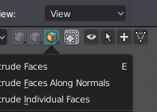
Current menus on the left side of header is take a lot of space, especially in edit mode. Converting them into only icon buttons can solve problem. Also, maybe it is a good idea to remove Vertex/Edge/Face buttons and merge them to mesh select mode toggles. The behavior will be similar to new toolbar buttons: one click is enable/disable mode, long click for opening menu.
Original header:
 Proposed header:

Of course it can be optional in case of not disorienting new users.
7 Comments
Would be good to just have icons when you "collapse menus" in the header right click toggle.
@ondraise15: It is a nice idea!
@stepanovoleg.dev: Yehp, right now when collapsing menus, it just thows a hamburger icon. This is hard to tell what it is when all the menus are hamburger icons.
I agree with this idea the current layout takes up too much over head space, I currently set it to collapse menues but with this layout you have more space and tge conveinience of your tools at one click
This make sense to me. I like it.
images lost? please can update the header´s images?
@Salvador Garcia: Forgot to make them public (ノ_<。) Thanx!