
Highlight Collection in the Outliner
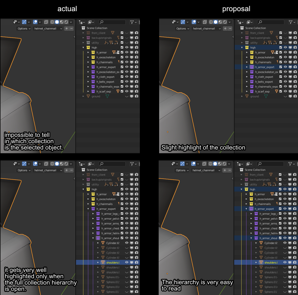
At the moment is very hard to spot in what collection is your object in a situation with a lot of collections and sub collections.
My idea is the least invasive as possible, to take the existing highlight feature and make it more convenient to navigate thru the outliner.
15 Comments
The current way that his is highlighted is with a white backdrop over the object icons to the right of the collection. So in this example these icons are obscured.
We need to find a better way of highlighting the collections that is unique & consistent with the established logic. Your proposal implies that the collections are also selected. That's not ideal.
So another solution could be to make the text of a collection orange if it contains selected objects.
The dependent collections must be pointed out in some way this is exact the reason why I made this proposal, in this case the outliner is still simple, I usually work with way more convoluted situations where to be able to see the little icon on the right I have to make the outliner full screen.
Tbh any solution would work for me, the highlight one looks the least invasive since it uses something that it's already in the code.
What a selected collection implies at the moment? Other than moving to collection to other locations in the outliner, there is no other functionality related to the 3D viewport. If we had collection behave like Maya, where they are actual containers with their gizmo and properties I would agree with you.
Now having selected multiple collections in the outliner does not impact the 3Dview at all.
The issue is that selecting something in the 3D viewport should only select the same items in the outliner. Not the collection hierarchy that the object is inside of. So the blue selection highlight must not be used for this proposal. Collections in Blender work very different than in Maya.
man, exactly lol, did you even read? selecting a collection does not select the hierarchy indeed, so the fact that a collection is highlighted means basically nothing, so why not use this to tell the user where the selected object is?
A highlighted collection means that the collection is selected.
Like I said, it's better to look for another solution. using the blue highlight is out of the question.
Select means what exactly? (since selected and active are 2 different things) Anyway this is my idea, if you have a better one please go ahead.
Exposing that barely noticable highlight in the theme settings could help somewhat.
That being said, child highlighting in collapsed hierarchies is something that every other software does, and can make working with complex scenes in the outliner a lot more user friendly than what we have now.
This is a great idea! Seems like it would be reasonably simple to implement as well?
One thing you could do to flesh out this proposal is describe how it would work with objects that are in multiple collections? Should probably still work but might want to be specific about how it would work
edit: wrong statement
Objects can be linked to any amount of Collections. They can even be linked to no collection at all, in which case they can be found in "Orphan Data". An object does not inherently belong to any collection. Every object you see in the outliner is a "real object"
atm objects in multiple collection are highlighted in every collection/location they are, so I don't see the problem here, we can maintain the same logic with highlight proposal
will be awesome a shortcut like "ctrl+f" or else
to jump to the target you can press the dot button on the numpad.