
Redesign the property panel
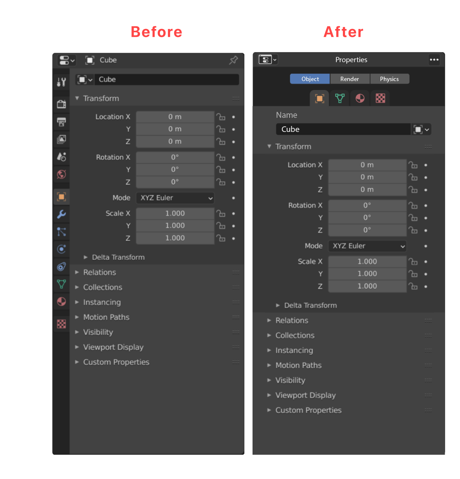
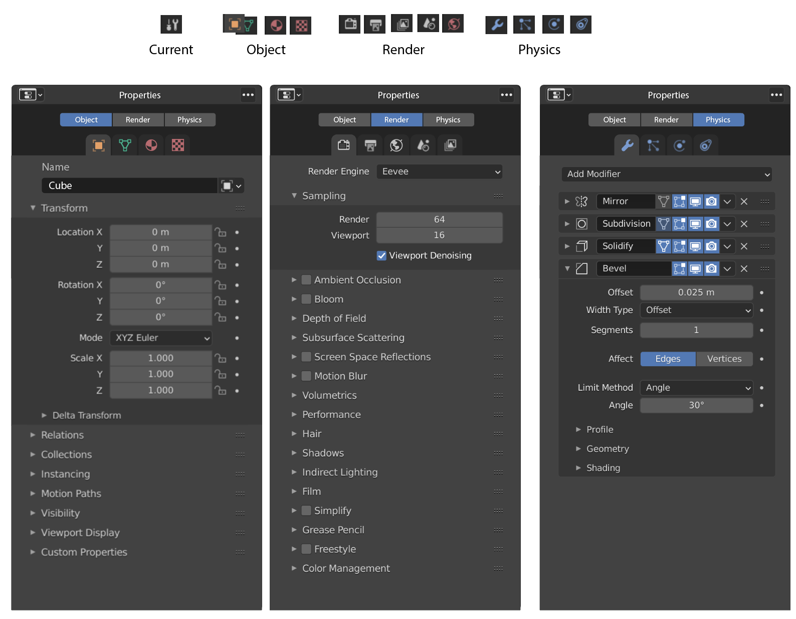
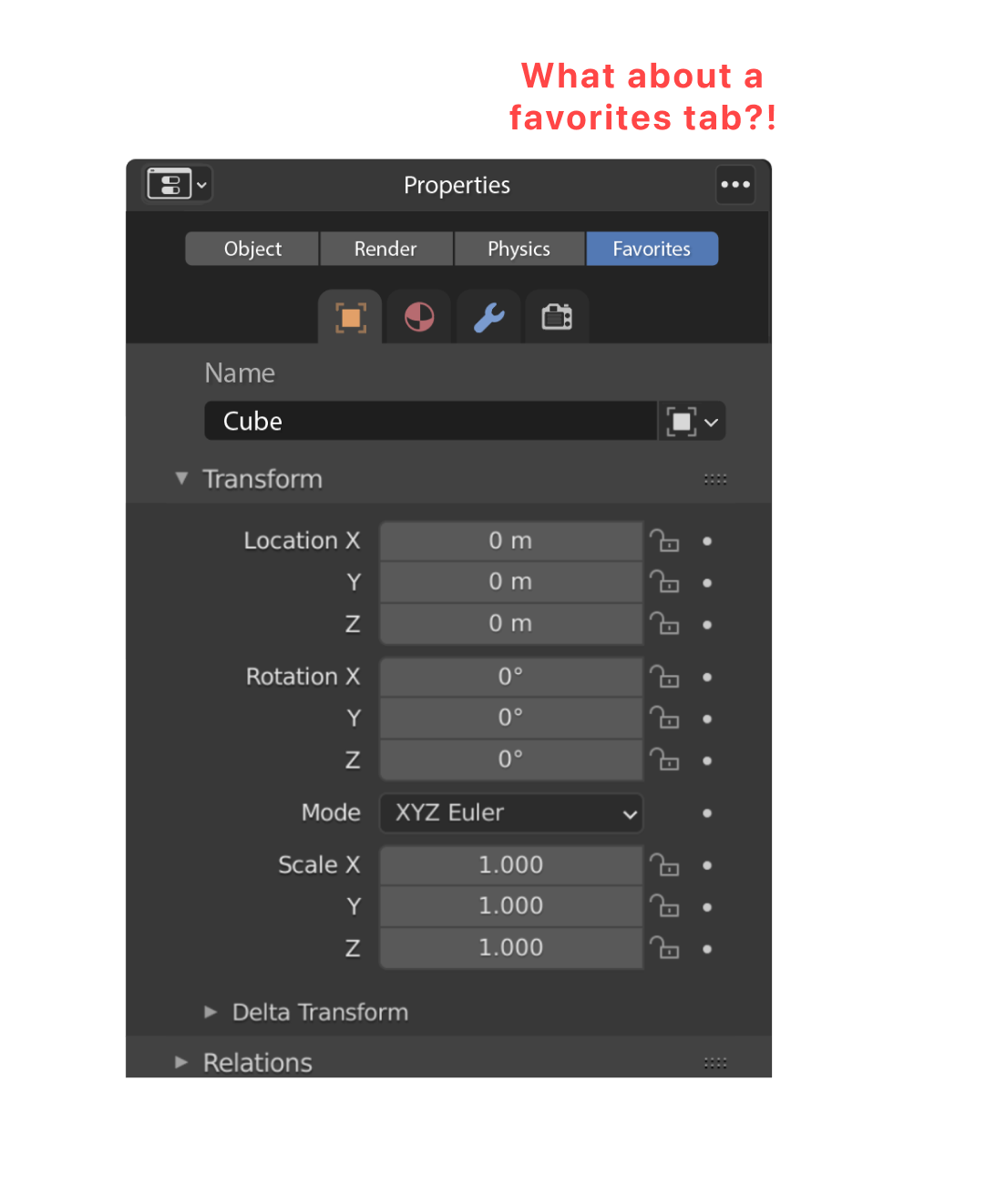
Clustering all the property panel sections in just 3 groups: Object, Render, Physics.
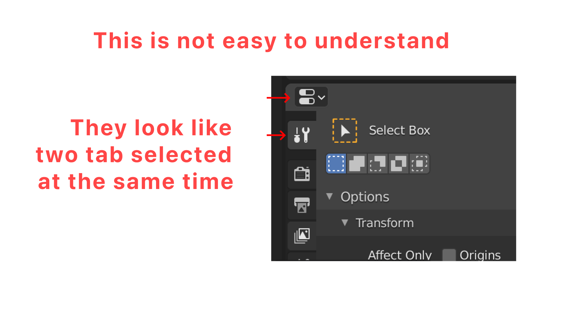
There are too many elements and if you don't know precisely where to find a specific feature is not easy.
For newbies is a kind of hell.
I know that someone may say that in this way not all the features are displayed, but this is exactly the point of a good UX, show the features only when and where I need them.
Please, let's work together on this panel, it's crucial in the experience of the software and at the moment it's really messy, thanks to everyone!
13 Comments
While I do agree that the Properties Editor tabs do have an issue with discoverability, and the "divide and conquer" is sometimes a good way to fix such issues, I don't think your proposal is the way to fix it.
You recognize one of the flaws yourself: it hides away stuff. You say it's a good UI thing, I strongly disagree in this case.
This kind of principle would be valid in the viewport, but here you don't "need" to hide away stuff in order to use it, you actually want to see stuff as much as possible. What is needed is to reduce the access time and readability. Hiding stuff in sub-menus isn't the way to go. It makes the UI heavier to use, adds more clicks for no real benefit.
The only tab grouping that make sense here is the Render one (though I'm not sure whether it's a good name).
That looks like you made one tab for white icons, one for the blue ones and one for the rest. And put arbitrary names that don't really reflect their contents (Physics category contains only two physics-based tab, the other ones are object-based, Object category contains stuff that are not object-centric, ... that's confusing).
oof.. sorry, that's a 'no thanks' from me again. this style of UX seems to be 'take something that nobody is complaining about and add a lot of empty space to it'
Because you are not taking in account all those people who didn't start using blender because the complexity of the user interface.
come on now.. complexity of the interface? if this were Blender 2.5 you could make such claims but in the 3.x era? please...
Cinema 4D has this approach of organizing its panels...
makes sense, hierarchy is obvious with your proposal... but good luck convincing blenders UI/UX team.
2.7 nostalgia :)
but as much as i like horizontal tabs, I think vertical is the way to go on the long run.
it has more potential for expansion, and follows same design logic as most of other blender windows (you only have vertical tabs for workspaces)
As alternative option, ok.
The benefit of very arguable (the argument follows) readibility is not worth the inefficiency of adding another hierarchical level to a permanent, primary menu. Just making it a bit more readable (by spacing and colors) would achieve the same goal BUT. And here's the argument - that is already done. The menu is separated into categories, it's jut that those are not Object/Render/Physics, but Rener/Object/Texture properties, which is bit more universal than how a beginner might perceive them. As an example - because "physics" aren't just physics. Those are any engines that can be activated for a given object and are not separable from object. Those that are object independent would be in the world or scene.
The spacing could be increased a notch, to make the separation more prominent though.
First of all it looks like your designs are based on old screenshots. My Blender doesn't look quite like yours so some of the suggestions are much less convincing than they would have been in the recent past.
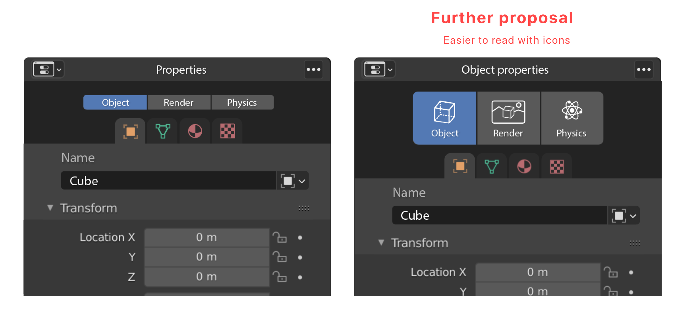
What other 3d programs do you use? If you asked around for opinions from people who use as many programs as possible you'll find the overwhelming majority dislike the overabundance of icons in maya and max, despise the overabundance of TINY icons in maya, don't really enjoy the largeness of icons in c4d contrasted with the smallness of many other things, and the only saving grace of zbrush is 90% of it is easy to read WORDS.
Ask an advanced Maya marking menu user what they think of icons.
You need to split this up into multiple proposals. "What about a favorites tab?" is not a proposal.
Something like a favorites tab that I need is all lighting related things to be combined together: the current world, the current exposure from color management area, all lights, all emission materials.
What If We Separate Context Sensitive Tabs and "World / Scene" Tabs
So you Can Swap Between the Thought of "I'm Editing X Things" and "I'm Editing my Scene/File/World/Settings"
As a newcomer I’d find the categorisation useful to understand the (many) commands and their use in different contexts. I understand that people already familiar with the commands could find everything quickly but Blender is a complex software with a fairly steep learning curve at the beginning: showing things progressively in some way (maybe different than this, let’s talk) could ease the first steps…
And a “favourites” space could be useful for power users, too…
I see what you're trying to accomplish here and I appreciate it. However, my main critique would be that your design is attempting to categorize things in a way that makes sense to you, but not necessarily to someone else. For example, one could argue that Materials are just as related to 'Rendering' as the other items. So a user would have to remember and click a category first instead of just clicking on the tab they want. I know good UX is more than just reducing clicks, but your design has just added friction to operations that users perform often several times within a minute.
Thank you for the feedback, I can understand "Materials" (like others) may belong to the "rendering tab" instead of the object tab but I think this is a very technical way of seeing things. I tried to design it in the most friendly and intuitive way.
When I create an object I need to think first of the geometry, then to the material and then I'm ready to click "render".