
Some suggestions for improving the Outliner
I slipped the offer according to the existing outliner where I mentioned with
the letters things that I think are important to add.
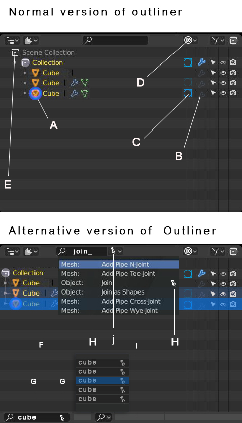
In the alternative Otellner I added a few features that I think will help a lot.
According to ABC
In the standard version of the Outliner
A
. A clearer sign for an active object.
B
. On / off switch to activate and cancel modifiers except subdivision modifier.
C
. On / Off Switch to activate and deactivate the subdivision modifier.
D
. Drop down list of ON / OFF columns.
E
. Giving up this headline will lead to space savings.\
In the alternative version of the Outliner
F
. A clearer way to display the last selected object from a list of objects.
G
. The standard search bar with the option to save searches with the pin icon.
H
. Search command bar with the option to save preferred commands with the pin icon.
I
. drop down list of preferred searches for quick navigation.
J
. drop down list of the preferred commands marked in the command list.
4 Comments
a) agree b) there is already modifier icon. No point to make column. Modifier icon should be active for all. No exceptions. After expanding you can tune em separately (already done) c) No. Just no d) b+c and no need e) agree: it is unique and can`t be double in VL f) agree g) may be, but i never use it twice. Filters work well. Separate outliner too. Anyway I will be happy if Blender will have better memory (search, file browser, etc) h,i,j — IDK
{attachment 170310jpg}
* @ Vyacheslav * usually when i do animation i like to understand how my modifiers acting but i don't need hi subD that's why separate them. it is very effective to turn all modifiers on or off at the base level ,it o.k if you have one objects , but if you have 10 20 it is very useful.
E)
The "Scene collection" really only occupies a line, it doesn't create any horizontal decay. The only space wasted is the blank empty space on the left. Which I can't see any purpose.
Also, I might be wrong but I think that there can be multiple "scene" collections. If not, well, no need to see that line when using the "view layer" mode.
B) and C)
To me it's really cluttering the outliner for nothing. You can manage each modifier individually through the outliner.
From a "common usage" point of view, I think that most of the time the user will use the modifier stack anyway as there are plenty other interesting options out there. And the need of turning off any modifier but the subsurf is pretty rare, as in any model with more than one non-subsurf modifier, doing so will mos likely be a heavy task, probably breaking the model, it's not something quite usable nor often needed IMHO.
And if there's a need to turn down subdivisions quickly or in bulk, there is the shortcut Ctrl 0 1 2 3... which will set the selected objects' subsurf to the askedlevel. As well as the "Simplify" tool, which allows to set a maximum subdivision level (which can be zero), as well as turning down particles and other stuff. That's what's used mostly by animators.
* @-L0Lock- * Hi i agree that is all kinds of stuff to put in the culms, coming from c4d ,it was very useful for me there,aspeshly when I needed real time playback, in c4d it was related to layers , doing all kinds of animations ,i find myself trevling all the time back and forth turning them on and off, gest my experience, anyway thanks for the feedback.