
N panel clutter
We need a permanent solution for this ...we are tired of disabling and enabling addons from workspace option in tools tab of n panel...plus with large number of addons it becomes quite difficult to find the right addon panel..in case of too many addons
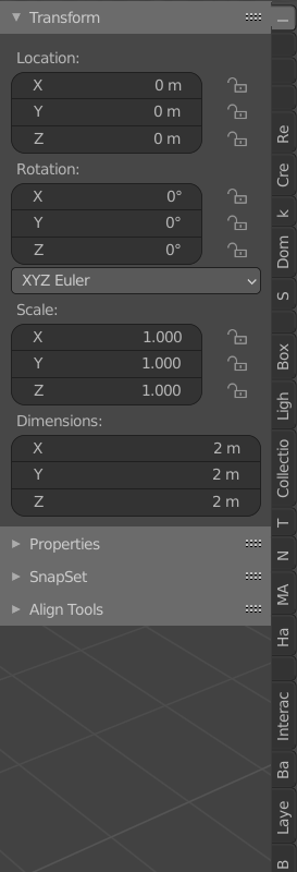
10 Comments
And what is your proposal?
* @ Lsscpp * check out modo kits or the 3ds max top bar/maya top bar layout....u will get idea about how they fit many things in small space
* @arkoprobhogupta23 * Hey, I'm not gonna install Modo or 3ds Max to check how a panel looks like. It's the job of who makes a proposal to show how to solve a problem. Here you just uploaded a picture of what is bad in Blender. A post on this site is meant to actually propose something better, and not just to be a pointing "this is bad" exercise. *edit: by the way, we all agree that sidebar has problems. It is a well known problem for the UI team too.
* @ Lsscpp * This problem can be solved by the addon developers themselves, they just choose to shove everything into the N panel. For example the animation nodes addon creates its own dedicated editor type that can be positioned anywhere in the UI like any other default editor/panel in Blender.
.....
* @ Lsscpp *....youtube....
Addon developers should be encouraged to make actual dedicated panels (like the info panel) for their addon or at least make sub-sections in existing panels (like the info panel) for their addon instead of shoving EVERYTHNG into N panel of the 3D viewport.
* @thinsoldier * that is not the permanent solution since in that way you will have to scroll down along unnecessarily long info panel
* @arkoprobhogupta23 * No I'm saying instead of an info panel you can have a panel/editor just for one addon. In some cases they make sense to be in the N panel of the 3d viewport and there still needs to be a permanent solution for the problem you describe. But that problem would not be as bad as it is if the addon developers get into the habit of putting their addons where they make sense instad of all putting them in that one area.
* @thinsoldier * I am talking of a complete UI Redesign...I know it is possible only in blender 3.0...Coding should be made easier ...if the coder has to do anything just for the sake of convenience of accessing the addon....it will probably make the code longer and eventually too many such unnecessarily long codes will hamper of blender performance also on low end pcs