
In the Navigation Gizmo, make the -ve axes distinct from the +ve axes
The Navigation Gizmo has three circles for the X, Y and Z axes. It has three smaller circles for the negative X, Y and Z axes.
When we click on these circles, the view flips to that direction.
But the problem is that we cannot tell easily which way we are pointing, because the circles for any +ve axis and -ve axis (e.g. +X and -X) look very much similar. The difference in their diameters is negligible.
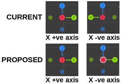
See the screenshot below. Here, you can tell the difference because you are seeing the images side-by-side. It is impossible to tell when you see only one image at a time.
The solution is to use a distinctly different shape for the -ve axes. (e.g. use a square or a hexagon for -X, -Y and -Z axes). Thus we can immediately tell the direction of view. If you want to keep the circle, at least provide a white outline for the -ve axes, so that we can tell the difference between +X and -X (and so also for the other axes).
7 Comments
Oh boy, it is already different with each other, the circles with connected LINE as axe are positive and the floating circles that are not connected are negative...
* @aslan.tamjidi * You may not have noticed this, but when you click on any circle (+ve or -ve), it jumps in the center of the Gizmo's sphere, and the axes appear to be disconnected from that circle.
Thus, AFTER you click on a +ve or -ve circle, both look exactly the same! And that's why we need a different shape for the -ve directions: a hexagon, a square or an outlined circle, etc
* @raindrops.fromsky *
* @aslan.tamjidi * There IS a tiny, TINY, MINISCULE border around the circles when you are looking at them from the negative direction. It's not obvious, at all. Click Z repeatedly to see it. --It's most visible here on the X axis. The Y axis is REALLY hard to discern.
Possibly this can be made more obvious with a different setting in the theme. Good luck finding that though.
Personally, I think a little "-" would be perfectly appropriate, and more user friendly. Might as well throw in a "+" too.
* @aslan.tamjidi *
Hi
You have compared X with Y and Z. That's not the right comparison.
To get your image, did you click on the +X or -x circle? That is the moot point: The image will be the same in BOTH cases.
* @raindrops.fromsky * I have to notice! maybe I'm still peering, it's very convenient to constantly notice and peer ...
Good low-hanging-fruit (LHF) suggestion.