
Areas management proposal
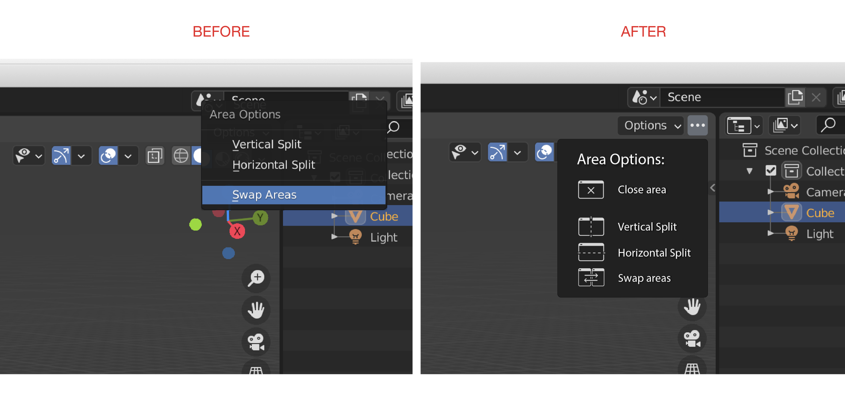
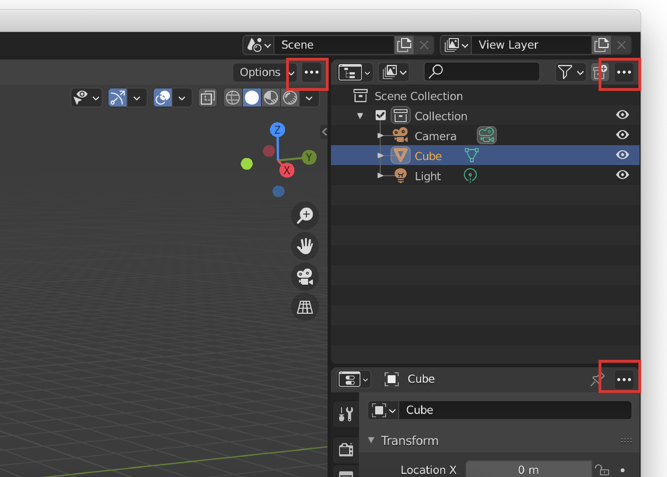
Hi, community, it would be more intuitive to have a "further option" button in every area's corner in order to operate all the basic actions such as close or split.
I know that I posted a similar concept a couple of years ago but every time that I have to explain blender to someone I never remember where to click to do those very basic actions, if on the top or in the narrow space between areas...
I'm a UX designer I'm open to find a better and easier solution together.
Thanks!
6 Comments
I personally don't think it's worth the extra button in the toolbar.
But if you think about it, the normal user of any software has learned that where there are 3 points, there are more features. The actual way for the splitting is not so intuitive, and a person as a new user could find it difficult to find out this feature without any tutorial. Let me know what you think ;)
Blender's UI team will do everything in their power to not add icons into anything in blender...
You are right, the current way is not intuitive at all, but anything UX related blender will fight to the death not to implement.
I get that new users need more approachable ways to access things in Blender, but covering up 25% of the screen with little boxes with three dots is not the solution. I mean come on.. take a quick look at your current Blender UI. Not just a little zoomed in box showing where one of these buttons would be but the entire UI- these little boxes would be everywhere and they do basically nothing that isn't already possible if you spend 5 minutes reading the manual before jumping in without any experience and trying to make your magnum opus.
I'll support it if there is an option to never show it. After having the whole UI explained to them I find most people never forget they can right click the border between 2 editors.
Most people probably never need to swap non-adjacent editors.
If you're the type who frequently needs to pop editors out into their own windows and swap non-adjacent editors then you're probably the kind of user who has no problem memorizing all the ways to do that.
The absolute worst thing about all other 3d programs except maybe zbrush is the overabundance of small, similar, confusing, impossible to remember icons.
Finalmente un interfaccia semplificata e che può aiutare ad imparare il programma in maniera più intuitiva :)