
More intuitive and consistent headers for the Properties Editor
Although the icons for each tabs of the Properties editor are very nicely designed; for new comers they are not helpful enough in order to tell us what the tab is about.
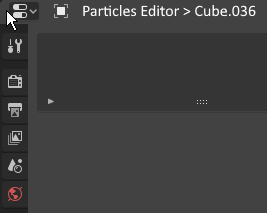
For instance, how I am suppose to know that the following tab is about Particles?

Furthermore, the current tab headers are not consistent, see Properties editor: Need for consistency overhaul (breadcrumb vs. title) .
I believe that we could simply replace the text "Cube.036" with the more intuitive heading "Particles" or "Particles Editor":

Or, if we want to keep the information about which object is being edited:

NOTE: The link provided above is giving solutions for each tab.
1 Comment
I do agree with you and it makes sense. And moreover I personally think that would be more productive to place object/object-data and related staff on top of tab row as we are more often change object properties itself vs scene/render/world settings or at least let user to rearrange tab order. Blender devs do a great work making 2.8 UI rethinking, but talking about Tool settings - there is a lot of real confusion among my students about why Tools settings exists in few places at the same time. And such unresolved ui areas is the main reason for us to reinventing a wheel with trying build custom made ui panels with easy and speedy access to often used functions. And IMHO some Blender 2.4x 3d-View floating panels was not that bad in curtain situations vs current and sometimes endless tapes in N side panel. I know maybe it's off-topic but I think it's related.