
Sculpt toolbar colors
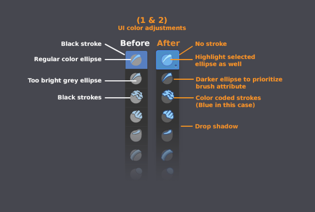
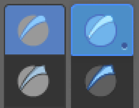
Here's a proposal for perhaps better colors for Sculpt tooldbar.
Currently in the toolbar:
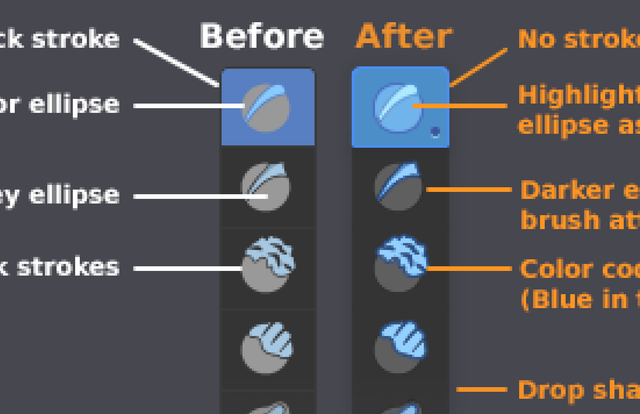
- Grey ellipse is too bright and it's fighting against of the tool's color coded attribute (blue, red, yellow) in "attention hierarchy".
- The color coded attribute of the tool uses black strokes, they could be colored with the same code color but darker.
- Black stroke of the whole toolbar is perhaps extra information
- Dot under the tool would tell user if it's currently "Adding" or "Subtracting"
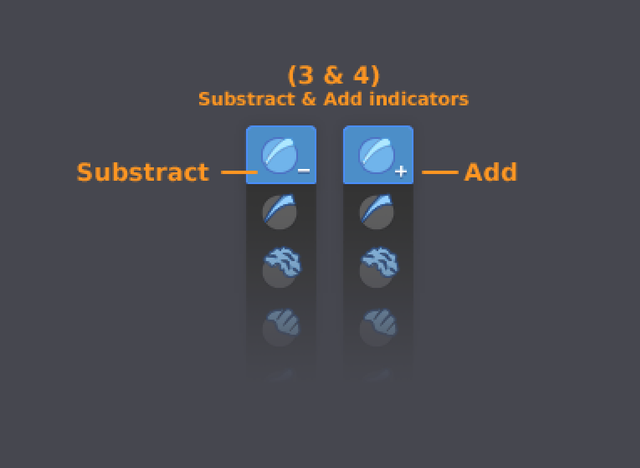
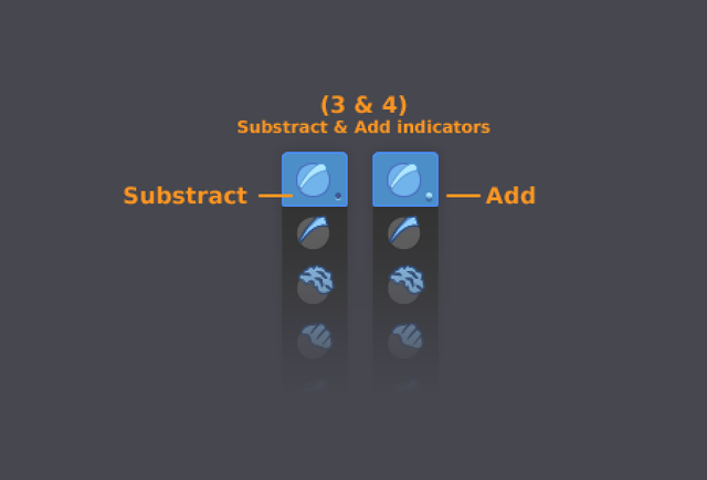 Or with minus & plus symbols
4 Comments
looks nice, but how about + for adding and - for substracting ?.
* @peter.boos * Good suggestion, added screenshot with + & -
They should the nuke those "2d style" icons and go pro... zbrush style.. hehehe...
I removed "Sculpting" from the tags. The brush icons are soon removed by the use of the Asset Shelf. Any remaining icon issues are more a general user interface topic.