
Legacy Mode UI (Clearer UI request)
Legacy Mode UI/Theme
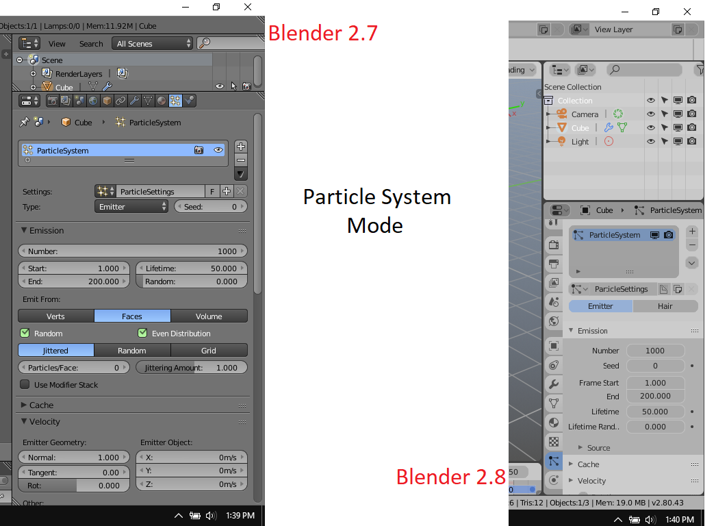
I don't know if is it just me or many people do notice it that having those simple, somewhat colored 2d/3d icons make the UI more user friendly and pleasing, Like it is creating a depth for the software UI and makes you want to use it more. Like it makes more more multidimensional and not too flat. Although I like the new 2.8 UI arrangement I still like the 2.7 icons and the visual atmosphere in the adjustment/tweaking menus.
Also having those slightly embossed/3d drop down tabs make it more easier to navigate all the options compared to the flat and minimalist UI in my opinion.
I have recently been using Gimp as my photo editor and at first it was so hard to understand the software's UI but after some changes in the user preferences where I switched the theme from a minimalist flat symbol icons to the classic 2d/3d with color symbols, it was night and day and I began to understand Gimps UI and it made it easier and fun to roam around its UI and discover its features. All that because the UI became more user friendly. (The Light Theme also helped).
2 Comments
The Bforartists fork has reverted the 2.8 code to legacy coloured icons. They plan to keep on using silluete and color to aid the UI. You can have that if you'd like now without waiting for 2.8 to consolidate this.
* @ondraise15 * Thanks Dude.