
Make Blenders UI Panelse more Readable/Better Contrast Again
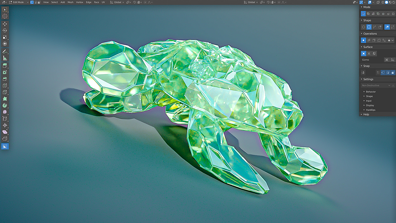
We used to have a way more readiable Panels back in the 2.8x days, look how much easier this is to read, and everthing feels so much more solid and connected in a way.
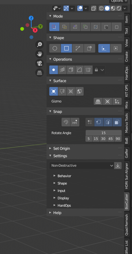 Compered to this in 4.5:
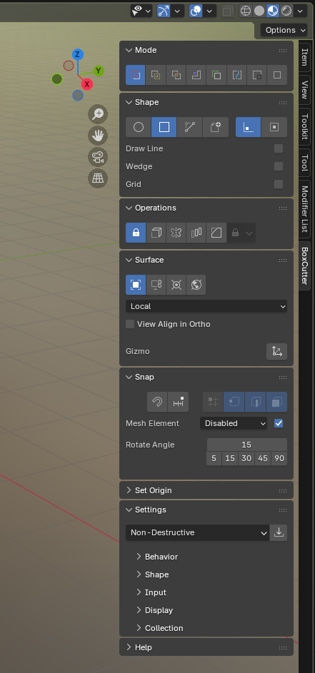
All these gaps makes it feel very disconnectedand noisy to read, I feel like if I am not careful I will accidentally click one somthing behind the panelse in the gaps, it honestly feels uncomfortable that there are so many gaps in the UI.
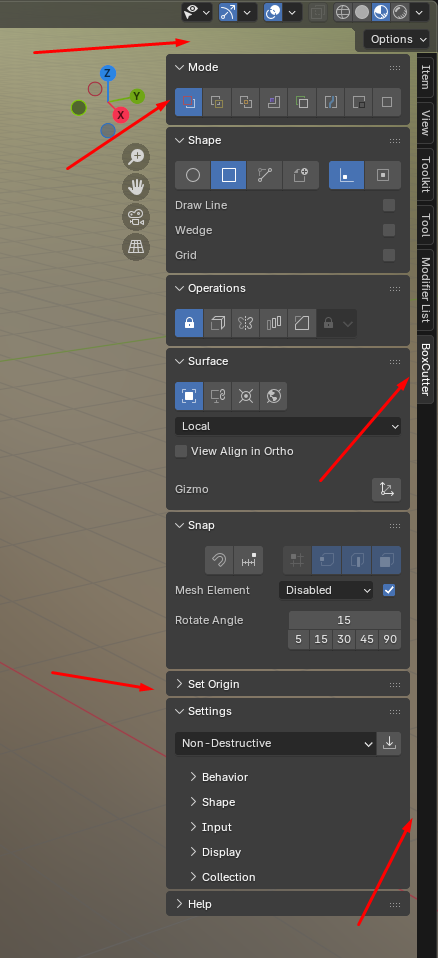 And its not help at all by the general lack of contrast, the UI right now feel soo grey and the buttons barely stands out. Before they where alwayse agains a darker background, making both the panel title and button clear.
Despite using the 4.x dailey now for over a year, I somehow found myself finding stuff faster in addons in the now very old 2.8x version, despite not using it for years.
And I really do not like the gap here:
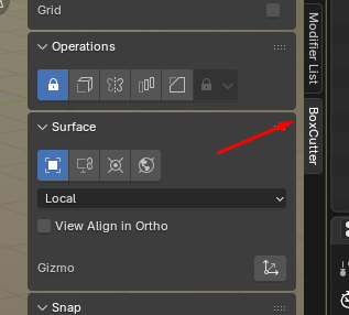
It just does not feel clear what addon you are using, due to the contrast and gap, compered to this:
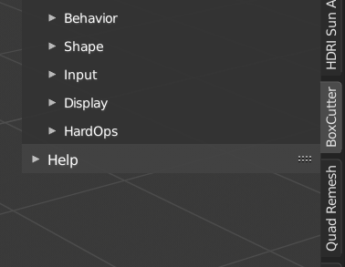
1 Comment
In general totaly disagree!!! for me so this is an exquisite design element!!! maybe you still do not like that the panels are transparent?