
Set the passepartout to neutral grey (or make it themable)
The brightness of the UI surrounding the content we create influences our contrast perception. For example, if something is close to a dark grey, we tend to perceive it as lighter than what it is. See the image below to have an empirical demonstration of what I'm talking about:
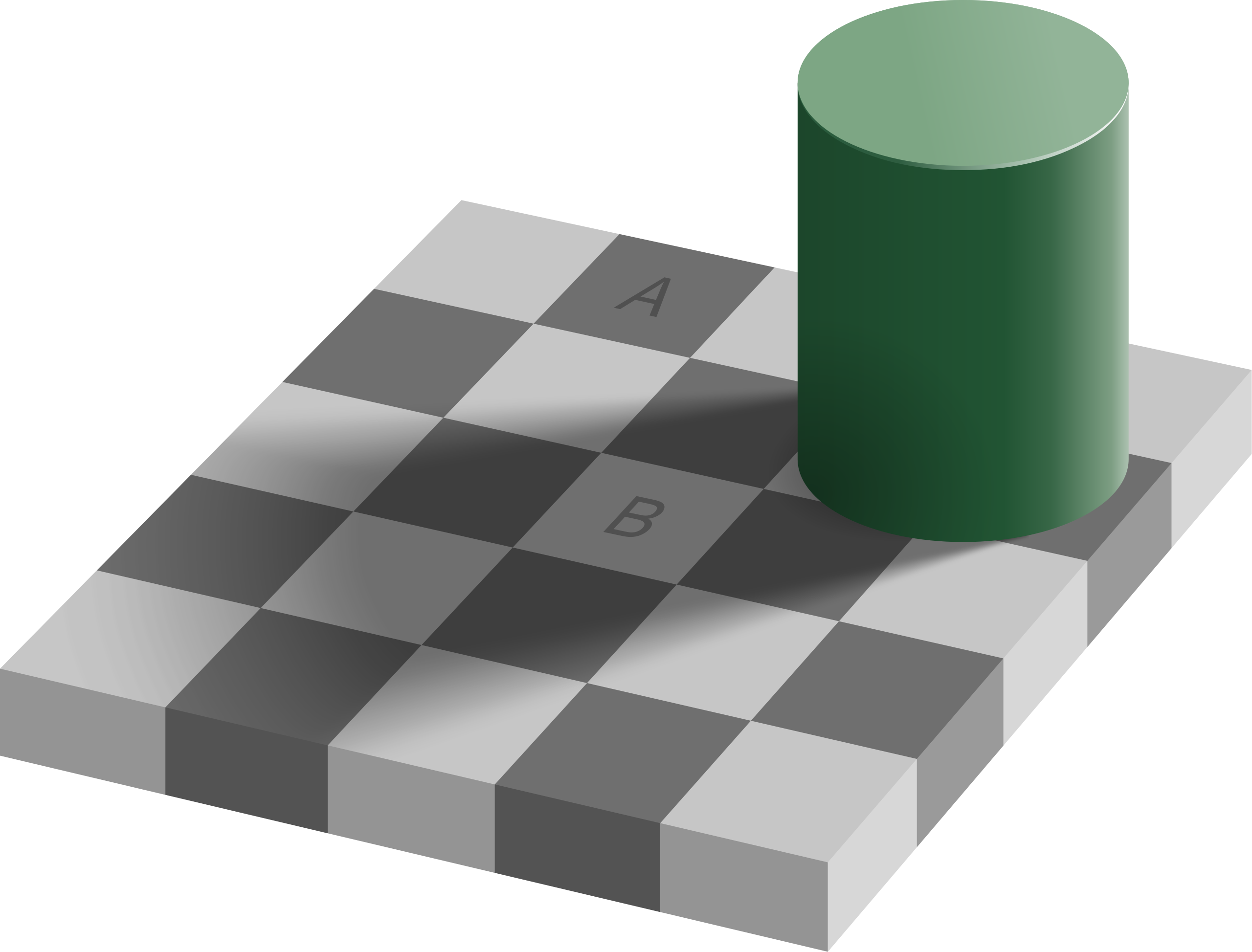
A and B are the same shade of grey. However, B is close to a darker grey, and thus we perceive it to be lighter than what it is.
The effect of this is that using very dark UIs, we tend to make our images a bit too contrasty. Another popular opensource software, Darktable, has reduced this effect by introducing a neutral grey theme. In Blender, I do not think that it would be necessary to change the theme itself. It would be enough to make it so that the passepartout color is not 100% black!
I have created a similar one in Blender, which I'm currently testing, however the camera passepartout's color cannot be changed, making my changes moot. In fact, without changing the whole theme, having the passepartout be neutral grey would be enough!
My proposed changes are two:
- make the passepartout color customizable
- consider the aforementiond illusion when choosing the default color for Blender's passepartout and, possibly, change it to a neutral shade of grey.
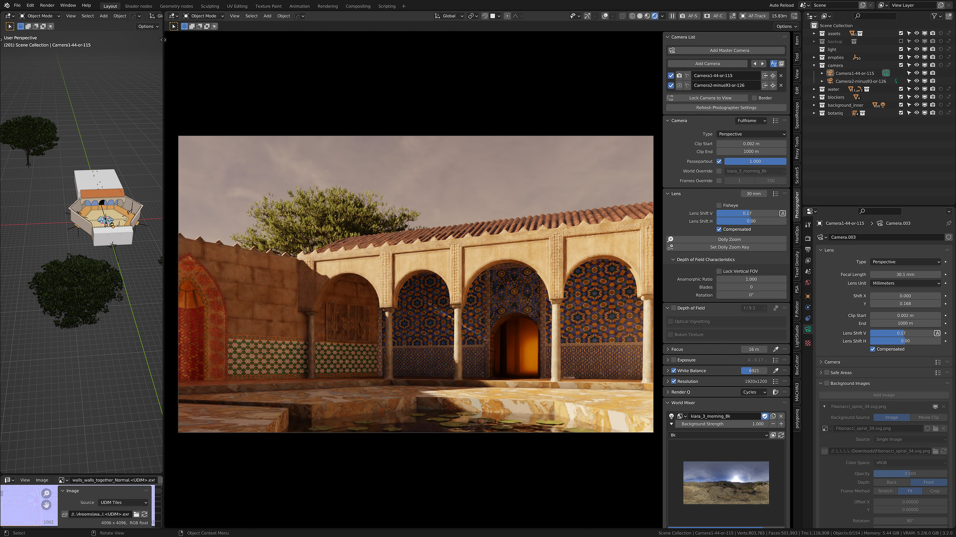
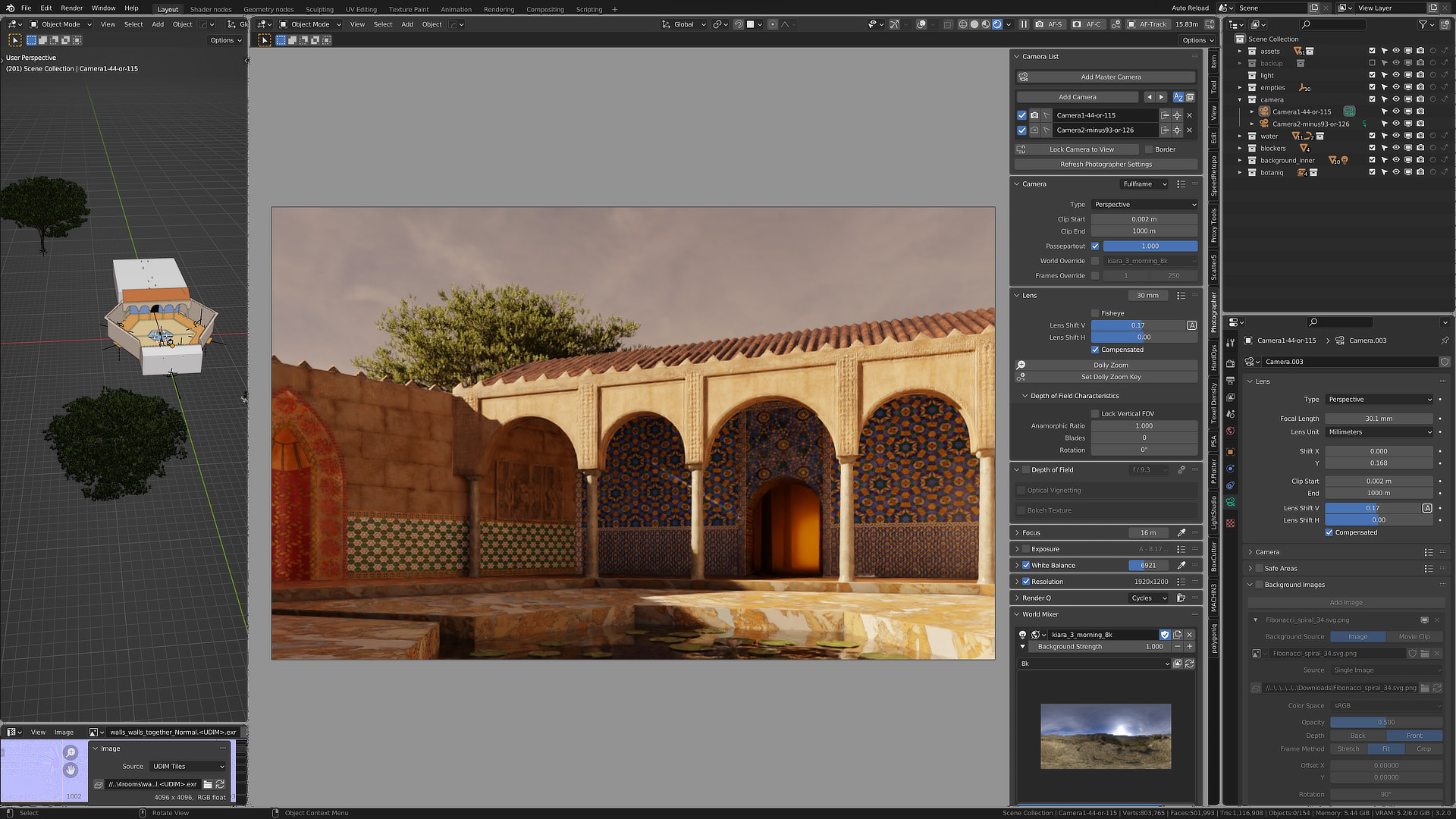
Here is a very rough mockup:
how it is:
how it should be:
UPDATE: I have shared a neutral grey theme here: blenderartists.org/t/theme-a-neutral-grey-blender-theme-and-a-problem-with-the-passpartout It is not very useful currently, as the passepartout cannot be themed. However, if this was to change, I'd really be up to polishing it and proposing it for being included in Blender and mantaining it in the future. I think it's a precious tool that can help a lot the final stage of a render production.
7 Comments
Done! projects.blender.org/blender/blender/pulls/104486
Amazing! Thanks to pioverfour for the commit <3
You should mention this at the #user-interface channel over at blender.chat since it's a really, really useful feature (tbh, it's almost a bug rather than a feature request, imo).
Thanks a lot! I will do this immediately. I hadn’t considered it!
do the right thing and use the deep grey theme. thats what should be the default theme
Can't be solved with theme, passepartout is hardcoded to be black and is not exposed in theme editor.
I actually have a theme I’m testing that is a lot greyer than deep grey, while resembling the default theme more. However, I feel it is useless, because, as the other commentor said, the passpartout color is currently hard coded!