
Add Theme settings for the outlines introduced in some UI elements in 5.0
EDIT 24.2.2026 Nodes got theme settings for Outlines, which is great! Thanks to devs. I hope the outliner gets that too.
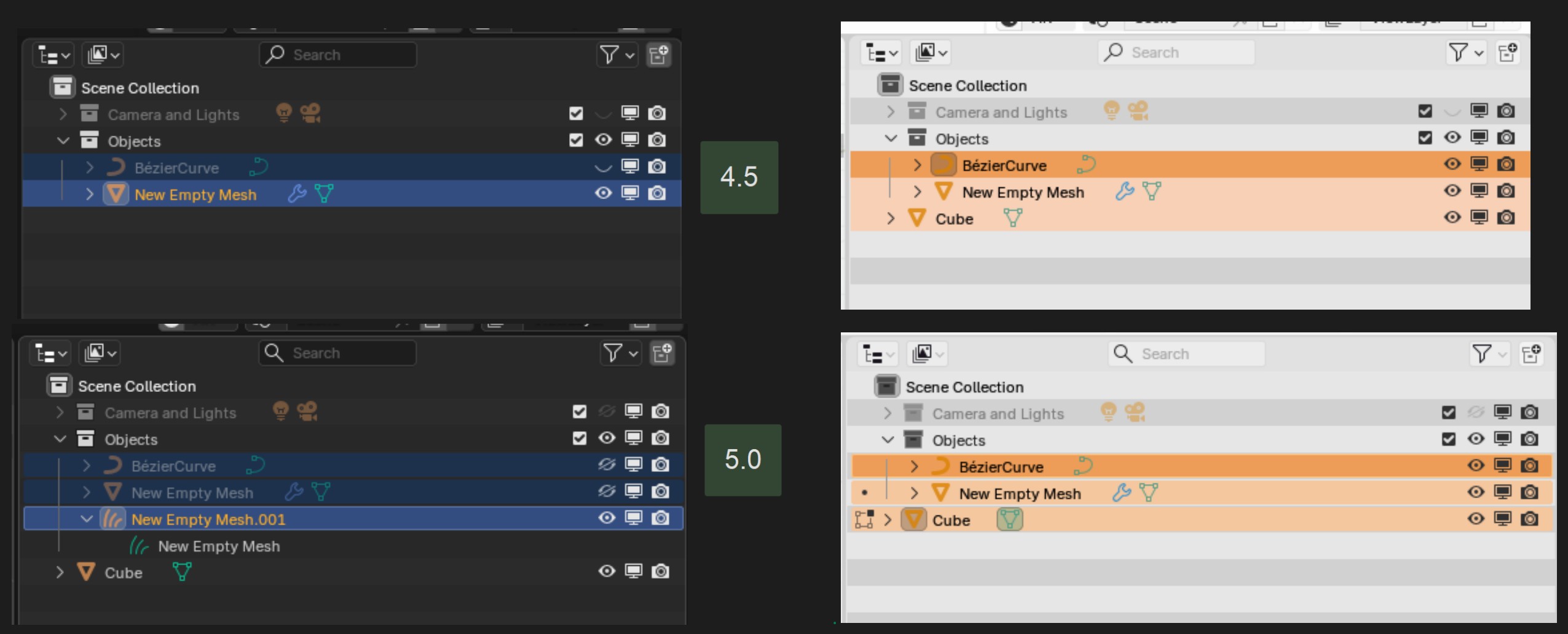
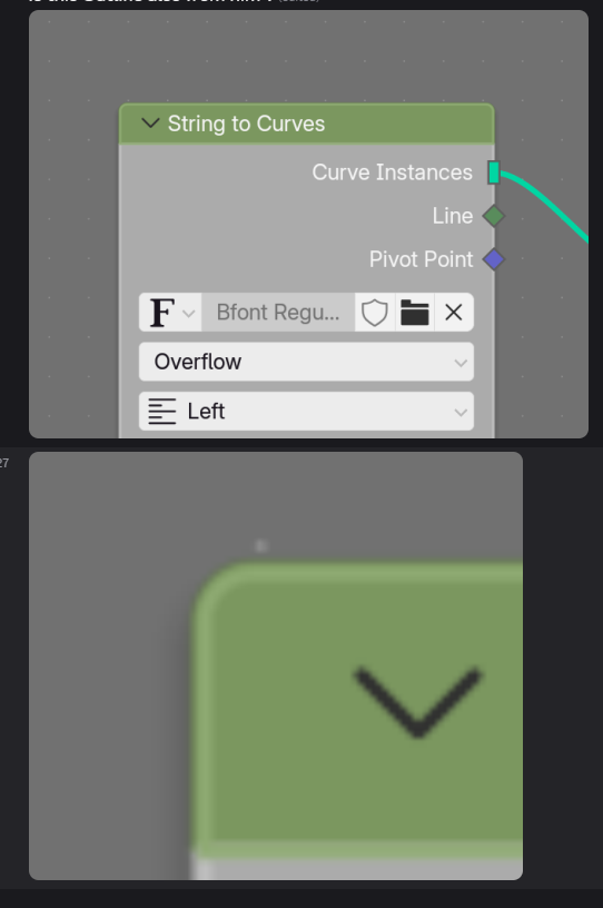
In 5.0 there are, in my view, some hideous outlines introduced to Nodes and Outliner. Of course, this is totally subjective matter, so some might find them good.
But, the sad part is that there are NO settings in theme for these new outlines. So, those of us who appreciate clean and simple UI can't get back to way it looked in 4.5
Outliner 4.5 vs 5.0
The 5.0 looks simply broken in my eyes
Outline introduced to Nodes in 5.0
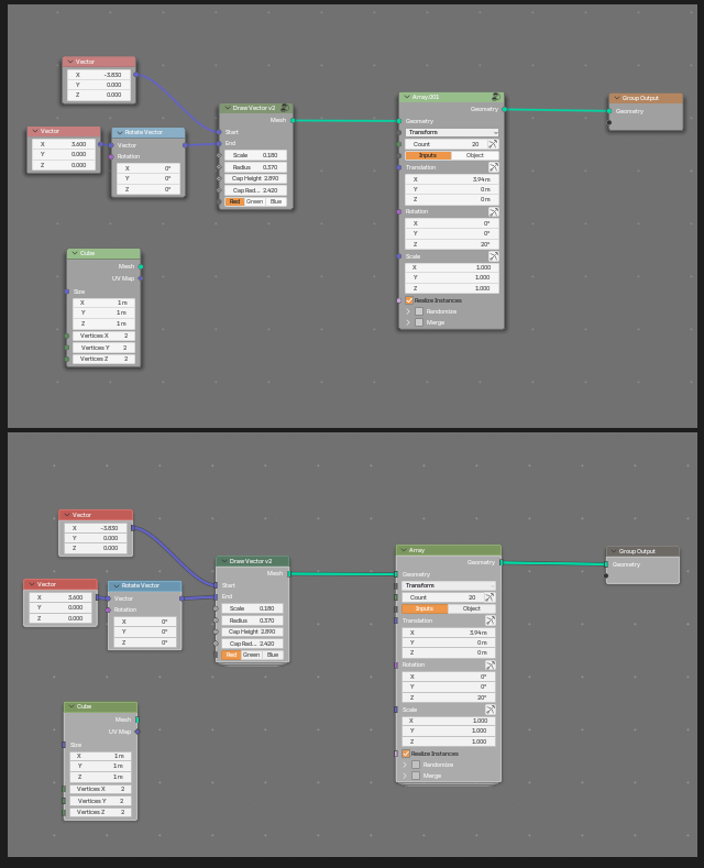
When zoomed out, the new bright outline makes the Node Tree look messy:
Disclaimer : I fully understand that my strong opinions about the visual look are totally subjective. There are no reason to argue if my taste is good or someone else.
The point is, the themes are supposed to solve this kind of thing. There are themes because people have personal tastes. So, this kind of change should definitely be added as on option to theme settings. Not forced to users.
11 Comments
right? hahahaha
i thought i was alone on this. glad to see some sane people around. ✌
i can tolerate the outlines in the nodes, but the one in the outliner is a disgrace. its just visual noise totally out of place, doesnt match blender in any way. i cant believe such thing was approved.
and yes, i already complained about that in the official ui chat, but of course no answer.
I'm also glad to see that I'm not totally alone with this. At least we are 2 now :)
I do expect that there will be much more of us when the 5.0 is released. It may be that there are fewer users with “sophisticated visual” taste among the ones who jump early on Alphas and Betas.
I didn't comment to this while it was in development. I started using Blender at the end of the last year, so I'm only now finding where things happen. And, also, it is kind of impossible to follow all the updates :) I made a comment on Pull request now that I saw it, but it's too late now, I assume. ( projects.blender.org/blender/blender/pulls/140371 )
I find it confusing how one person can push this kind of changes, seemingly nearly without any discussion or taking account any criticism. And I really don't understand how this was approved without adding the settings to the theme.
I wasn't going to post a wall of rant.. but apparently I did :D
Yes it is too late now, at least for 5.0! I personnally like the new look, but I understand some people will not like it. Let's just hope this setting gets exposed in themes for 5.1
💯
I thought the outline in the outliner was a bug.... it must go...
Outlines? Absolute first thing that need nuclear treatment is node group indicator I'd really prefer to guess what's node group and whats not with hitting tab key, every time I look at this node group indicator little kitten dies, in Sims, but it still counts!
Looking at those screens I can say that the outliner outline maybe looks a bit better before, but seeing that I've used 5.0 for a while without noticing the new way the outliner looks I don't think it's that big of a problem at all.
Having that said I think a theming slider for the outliner opacity is in place, even if I think the theming it self is a bit bloated as it is atm.
The new way that node group looks though...
It is also quite depended on the theme, how good or bad it looks. For example, in default Blender Dark theme, the contrast between Selected object and background color is quite low, so it doesn't look as restless as with some other themes.
And this is also the reason why there should definitely be a theme setting. If theme has effect on how good or bad it may look, then it should be adjustable in the theme.
I got an answer from Pable Vazquez in developers chat :
"Hey. There's no theme setting planned for this, in the same way there's no theme setting for the outline around the icons for active elements.
The outline around row of the active element is meant to mimic this. As an accessible way to tell apart active elements from non active. "
horrible, just horrible. active element has already a different color theres zero need for this weird outline. zero.
but at least you got an answer lol. when i complained i got nothing hahahaha.
if they think that stuff like this is ok, i have fear for the future of blenders ui/ux. we are doomed my friends
I'm also a bit afraid that this is an indication of the general direction the design is going. I hope it wouldn't be. Personally, I wouldn't care a bit if there was a theme setting for these new things.
they are adding a theme setting for the nodes outline but not for the outline in the outliner. it makes no sense. if you are going to fix it, then fix the whole thing. what is this? this is unbelievable. i have no words. 🤦♂️ projects.blender.org/blender/blender/pulls/148532