
collections colour highlights
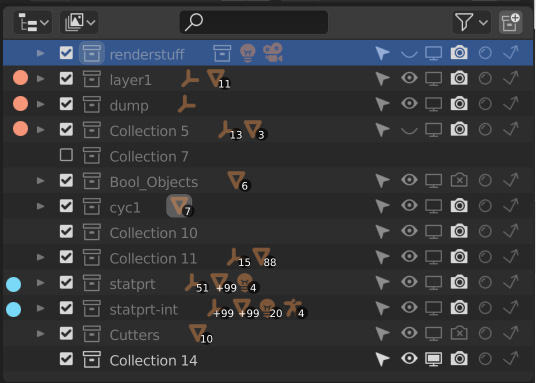
Colour highlights in the collections panel. Just a quickly identifiable way to group collections, not in any technical sense, but for the user. So all the collections for characters could be blue and sets red and lights yellow, whatever the user decides. But it would not cause and other relationships.
I find this useful in other apps like photoshop and after effects.
I thought I could have more than one image, I have attached one with dots but having the whole line tinted a colour would work just as well.
9 Comments
I like the idea but don't forget that collections can be nested and you can pan in the outliner. It would be better to color them like it's already done for instanced collections, by coloring their boxes instead.
Here is my 2 mins mockup but whatever solution that works well is fine by me :)
* @adamsanim8 * Exactly my thought. Not a bad idea, but coloring the box would avoid that eating-space column for the color tag.</br> Also for all those concerning about the "color mess" and readability, this would 100% up to the user. Anyone can just leave the box empty as it is now by default
* @adamsanim8 * I love this idea. Non-obstrusive and super handy at a glance.
* @adamsanim8 * Sorry i dont like it, but i can imagine in workbench an option to randomly color by selection (then one doesnt need to maintain colors in such a way as well)
Check this topic on the BlenderArtists forum:
blenderartists.org/t/outliner-layers-colors/1186538
* @ xan2622 * It seems William Reynish liked this proposal :D
Duplicate of this , this and this
* @David Vernaglione * Thank you for pointing these out. I clearly messed up my searching.
adamsanim8, yep thats even better. I had a similar version in my second unposted image. lLsscpp. exactly, this would be 100% optional. default would look the same as now. I never got the colour mess argument. I kept clicking on world instead of material because the icons are so similar and they are both red. If world was light blue instead it would be clearer. The current monotone UI craze is harder on my eyes.. thats a bit of a tangent though.