
Theme options required for high contrast theme
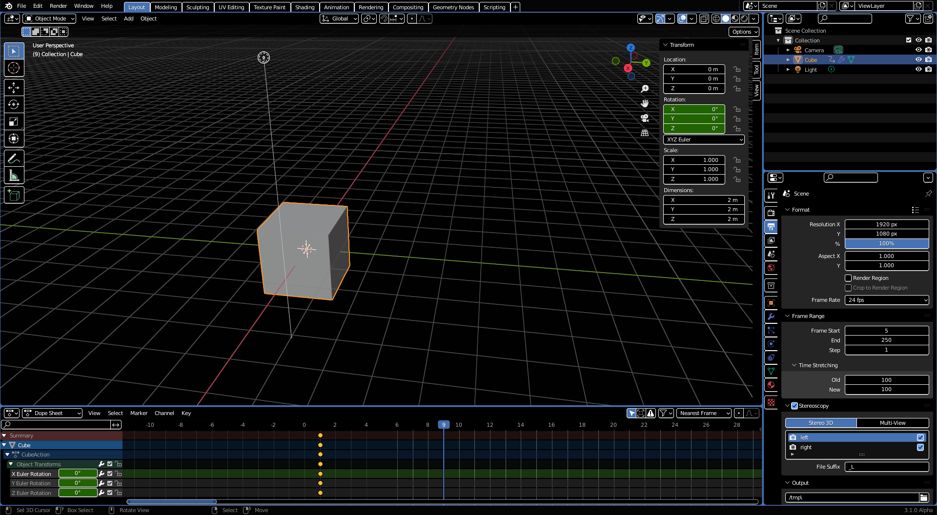
I was working on a high contrast theme for Blender 2.8X, in order to make the software more accessible for people with visual impairments, as well as helping those that appreciate fully dark themes.
Some design principles for such a dark theme:
- Black background, white primary color (increase contrast of elements that currently use shading/gray tones)
- Blue selected color, yellow tweaking color (two different colors are used so you can keep track of your current action)
- Outlines for interactive UI elements
- Blue outlines for areas and popovers/menus
Here is a WIP screenshot of it:
Of course, you may want to increase UI scale, use thick lines, different font etc.
Sadly, a bunch of options in custom themes are currently missing (means they're using hardcoded values for rendering, or lack e.g. outlines rendering completely). Without them, such a theme would have a few areas where the separation isn't clear and contrast isn't incredibly high.
I've compiled a list of options that are missing to make this theme work well in all editors:
- Outline for pulldown (see menu in 3d view)
- Editor header outline (see tool settings bar of 3d view blending into the background)
- Navbar outline (see properties editor)
- Color of disabled elements (see X buttons on top right)
- Colors used in tooltips (for example red error color, python info color, or the color of values)
- Value slider "Item" color when dragging
- Colors for hovering (some elements don't show hover at all when using black bg, and others will use the Selected color instead)
- Tab text (not navigation tabs!) can't be different for active tabs
-
Grid color for node editor / movie clip editor / image & UV editor ( D8699 , D8234 ) -
Alternating background color for VSE / info editor / file browser ( D8717 ) - Highlighted line of text editor (outline if possible)
-
Python console selection should render behind text ( D13111 ) -
Header color when editor is active (the header turns slightly brighter by default) - changed in D13008 - Node editor nodes outline/shadow color
- Toolbar "nested items" marker size
- Start/End frame in time editors, like dopesheet ( D13116 )
Although the theme could already be used like this, it has a lot of accessibility issues still which need to be fixed by implementing some of these changes above (and updating the theme accordingly).
3 Comments
Good initiative! And really the themes will be more powerful if you take into account these possible configurations.
Where can I download the theme?
* @woodsjames * Here is the WIP version shown the post . I stopped development on it due to these restrictions, so it may look unfinished in some places and should probably not be used as-is.