
Blender 4.5+ UI Feedback
I have some UI feedback (using 4.5LTS):
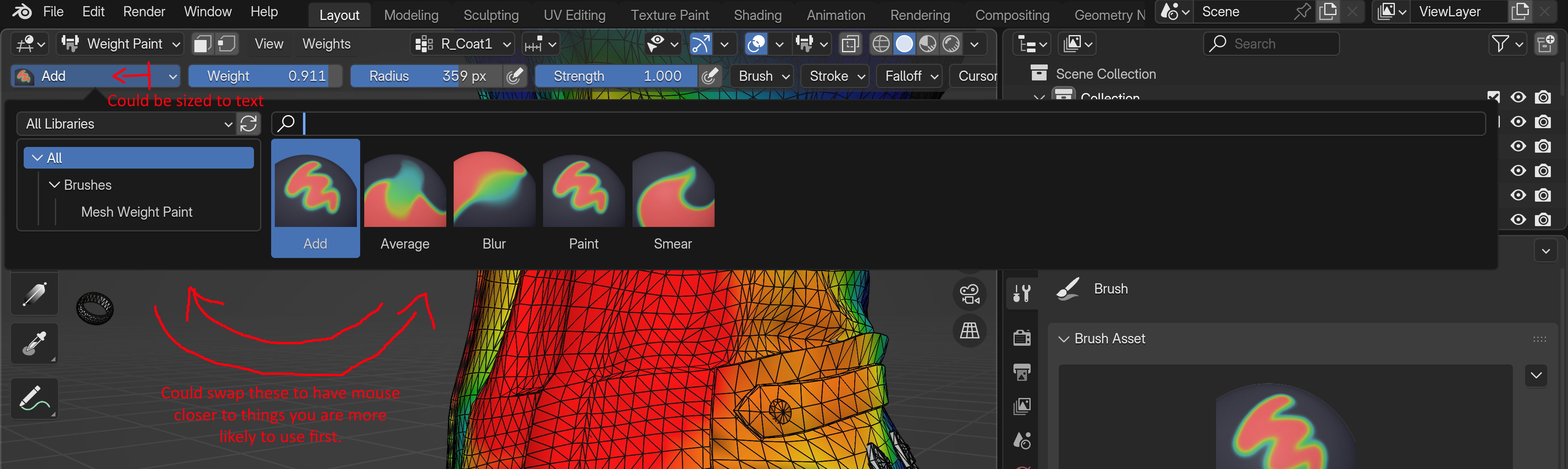
I think these could be swapped around, because it's more likely the user will go from clicking on the paint brush to a paint brush rather than a library. So it doesn't make sense to have to move your mouse past the library to get to the brushes first. (See image)

What happened to useful set of brushes from before already there in 4.2? I understand that you can set these back up and set different blend modes for the brush. But it would make sense to by default have the same brushes users are used to already from previous versions in the library. And plus it's not just about what people are used to, it's about having a good set of brushes by default. Personally I will be setting these back up. And while I'm at it, I might as well mention that I think a larger brush size would be better for everyone by default. I also can't modify and save the 'paint' brush because it is apart of the essentials so what I have to do each time is select my created 'draw' brush instead. Maybe since LTS versions get bug fixes the weight paint undo issue could be fixed for that.

It seems the area where it is labelled for the brush in the upper left and where you can select the brush, takes up a larger amount of space since the older versions. Maybe this was done to support longer names of brushes? Then wouldn't it be best to resize that box depending on the length of the brush name? That way it could be smaller and expand with larger names.

Maybe another suggestion is to be able to use the up and down arrow key to go through vertex selection while mousing in the 3D viewport instead of having to mouse over there and do it. Otherwise, the up and down keys aren't be used for anything else as far as I'm aware.
0 Comments