
Properties Panel - UI/UX Improvement
I think if "Passes" "Scene" "World" and "Output" panels will be merged in general setting as sub panels and at least main blobby settings interface will be packed space efficiently, there is space for everything and more.
ya, probably I'm old fart. can't help it
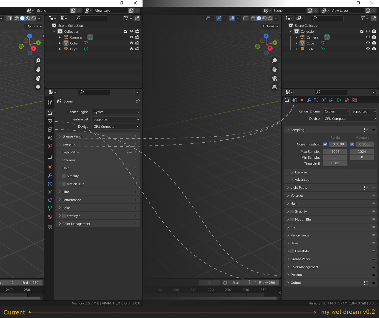
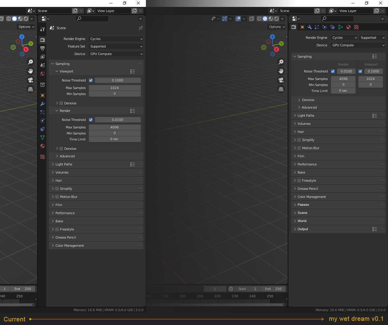 *update1 - only add "passes" "output" in render settings and put "scene" and "world" in one separate menu. also showing all with outliner
2 Comments
First of all, you're suggesting multiple different things.
You're suggesting that some properties be put side-by-side (something I kinda agree with, and I could try to dick around with ui.py to do it),
that the tabs in the properties editor be laid out horizontally (something I'd rather have as a toggle, like with headers being top or bottom),
and that those 4 tabs be merged (something I completely disagree with).
Split these suggestions up.
Second, your 2nd picture conveniently omits all the new dropdown menus that would show up were you to actually merge the 4 tabs. It would become an absolute mess . Nevermind that a lot of said properties don't belong in a unified "render" properties menu, such as gravity, custom scene attributes, units... The render properties by themselves are already pretty big and I'd rather not shove more unnecessary things in there.
The tabs let me have different dropdown menus open at once without scrolling. I can have my samples, film and color management open in the render properties, and have the format, frame range and output open in the output properties, and easily switch between them, and it makes sense to do that. Everyone is going to have their format, frame range and output dropdowns open.
Scrolling is annoying, inferior to having tabs, and also seems to confuse people, as tons of people don't even know you can change the colors of materials in solid shading (a setting you will almost always need to scroll to)
Also, you conveniently seem to have no outliner... The properties editor should be usable with at least a bit of outliner above it. That's how the default startup file is laid out.
It is quick mocap I was thinking about and did not wanted to overthink, rather I wanted to know what others think. I agree putting everything under render settings can be messy. like u said physics settings can really be separate(I completely missed it) but I really like idea of "output" panel being there with resolutions/color management stuff, and render settings is not a bad place for "render passes" I think. Yes it includes many tweaks, but I had do make it one piece to see whole idea, I am adding more dropdown menus and same time saving lot of space with optimization which will make it less scrolling needed and this unification more possible with little drawback if any(removing icons from sidebar, gives more horizontal space in which horizonal side-by-side setting can save huuuge amount of space without any drawback and it will be easier to read with not need to open sub and sub many) in my example one single dropdown menu "Sampling" reduced almost twice and is it less readable/usable?. maybe someone will take something from it and make it work, like u catch side-by-side layout. * I added new image. in current version with default view with "sampling" panel open, whole menu is not even visible and with my version its not only visible with open "sampling" panel there is space even with two additional sub menus. hmm, what do u think