
Desktop Icon Colors
The Problem:
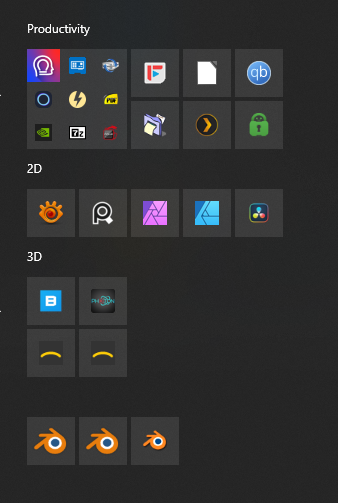
(From left to right: LTS, Stable, Daily)
The Solution:
Add a colorized way to differentiate between build types.

[Update]
Deuteranomaly (red-green blind) friendly version?

Please let me know if you can see the difference between them if your vision is chromatically limited.
7 Comments
I appreciate the idea behind this but I would prefer a clear text tag in a corner of the icon instead of a mysterious color code approach.
I'm red-gree colorblind and can't really tell the difference between stable and daily
Great point!
If the devs run with this, they should take into consideration luminosity values so you can also differentiate between them all...
Just made a second version for you, let me know what you think...
yeah that works
definitely
Forget it, it'll never happen.
blender.org/about/logo/