
More screen space!!!!
the top white bar is a very inefficient use of screen space just to show the 3 buttons. T
his version would work way better and surely not hard to implement??
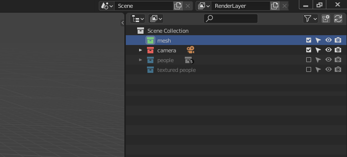
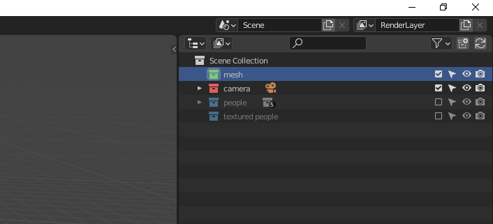
This idea was marked as a duplicate of Window decoration border.
1 Comment
dupe (use the search): blender.community/c/rightclickselect/Rjhbbc/
side note- you should avoid speculating on how difficult a task would be, because you don't actually know and the speculation does nothing for your proposal.