
Value levels visualization for color ramp node
I’ve recently been thinking, it’s sometimes difficult to tell where the color levels are strongest when using the color ramp. In certain cases, it can require a lot of tweaking to find the perfect placement for color ramp points. I think it would be very helpful to have a little graph, similar to the one found in Gimp’s “color levels” dialogue. It shows you where on the color ramp the input colors are highest. It is very useful for quickly positioning the ramp values when doing color grading.
I can understand this being hard to do for materials and other procedural workflows, but it would be nice to have for compositing at the very least. Perhaps even with an option to
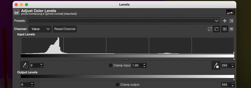 collapse the graph for either performance or aesthetic reasons.
3 Comments
We do have histograms and other scopes in the Image Editor:
ooh
regarding materials, I dont see a working solution for that at the moment. There is no finite image taht calculations could be done on but infinite prozedural textures and so on. And a Material works different on different objects, how would that work? Due to mapping one object could be black, the other white with the same material. It would also need to be updated constantly to reflect changes and that could cost a lot of performance.