
compact top menu suggestion
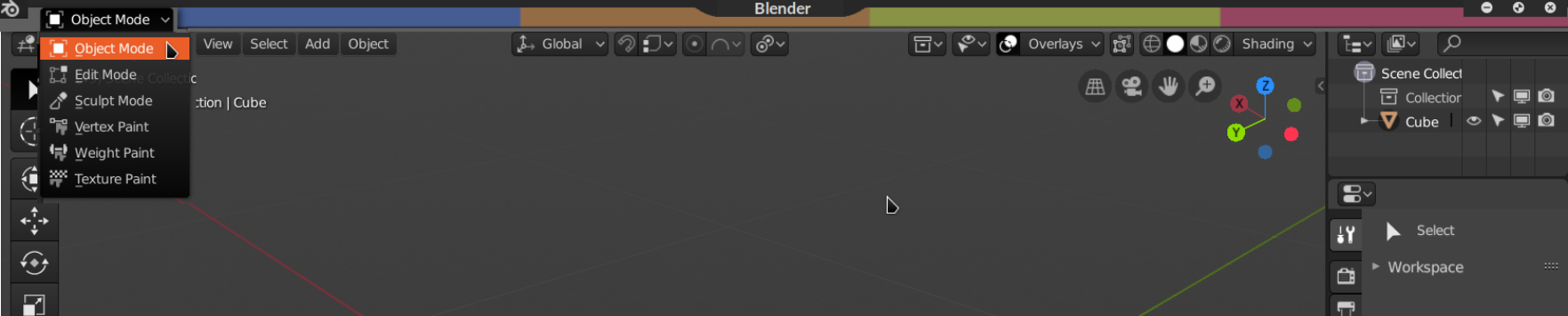
EDIT: see picture attached, could put the mode above to the left of these colors this draws attention to the mode as being a very important part of blender, where it rightfully belongs.
o idea is you would hover on one of the 4 colors each representing a menu
blue = main nav
orange = top bar
green = workspaces
pink/red = scene/layer (hover state not shown cuz lazy)
on hover the color could brighten a little too.
this is not in fullscreen but feels like it. you can move window by placing mouse on blender text in top mid or the logo at left.
links to vid & gif showcase
video peertube link: bit.ly/2Sf1Gd0
2 Comments
I had better give some real feedback.
Just my initial thoughts.
I must admit I would i would find colored tabs at the top very distracting. Big blocks of color grab my attention and keep drawing my eye to the top, not good when I am modeling or coloring.
I think it adds another level of complexity to the interface giving you more to learn and more to have to look through until you find what you want.
It doesn't really give back much screen real estate and you would need to have more space between the colored tabs and buttons below them to prevent you from accidentally going into that area when you hover over a button below.
However it is a starting point, maybe develop it a bit more.
lol Wouldn't want to look at that with a hangover