
Inherit object type colors for outliner icons to improve readability
In scenes with complex hierarchies that include many different object types, the readability of the outliner goes out the window. Since many objects in the 3D view have their colors exposed in the preferences, wouldn't it make sense if the outliner inherited the same colors for improved readability and consistency across the outliner and 3D view?
I would also be in favor of a way to differentiate root points (RP empties in my image) from its children.
Quick example:
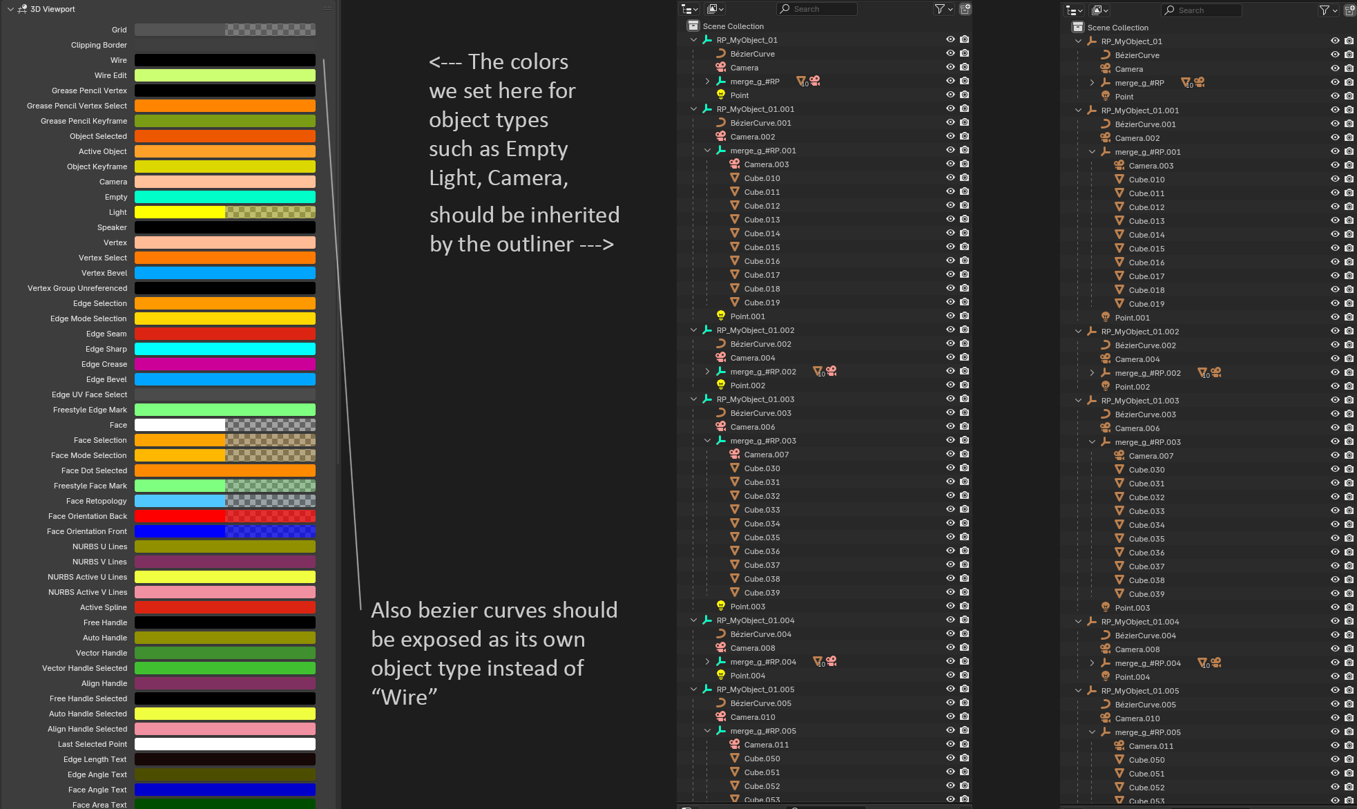
An alternative to colors could be different hues of the same color. Just something to tell the object types apart.
12 Comments
Over the weekend I gave it a little try and turns out it's not that much code to make it happen.
However, the moment you have lights, cameras, and empties, with a color, you want all other objects with colors but they don't have theme settings. So instead for Meshes what I did was use their object color.
I'm thinking this could be a radio toggle
Icon ColorLooks very cool.
Out of curiosity, do you know why only some object types are exposed in the preferences (Camera, Empty, Light, Speaker)?
Already a huge improvement of the readability of the outliner, nice work!
Hello Pablo! I'm just curious if there has been any developments regarding this topic? What you did here looks so promising.
Forgot about it for a while and these days I don't have much time due to the upcoming release. But if there's interest I could give it a try again and put up a PR for testing, after the release.
Haven't look at the code but I assume it's due to low demand? Which other object types would you want to have a dedicated theme option? At some point it becomes overkill and over complicates theming.
Absolutely, there is a good amount of interest in our team at work!
The idea of colors being based on object types can be tweaked. I'm sure there are better ways to do it! In our case at work, at least Empties, Meshes, Curves and Lights would be hugely helpful to color code in the outliner.
I'm adding some weight behind this. Outliner readability is one thing I miss from C4D and Blender is just the app to make it happen!
Questions:
You could leave default as it is, but add an option in the Interface preferences to for outliner icons to inherit object colors. Which means no change for the average user but the option for power users to customize their outliner.
As for themes, I don't think the inclusion of this option would affect them in any way. There are already themes with questionable readability.
extensions.blender.org/themes/genuinely-disgusting/
This would really help me navigate Outliner more easily. I’ve hoped for this for years! +1
I just asked myself "would adding all those colors" increase, or decrease readability?
After studying your images back and forth, I've concluded that it would indeed help for quick ID of particular classes of objects.
Big plus one.
Big plus one for option to enable object color to icon color in outliner here aswell. In our studio we heavily rely on naming conventions and parent-child hierarchies for automatically setup game assets in Unity. Colliders, Shadowcasting, snap points etc. - All components (usually mesh objects) of a single asset. This means alot of components and many objects in the outliner to manage and color coding those would truly be amazing. I like the idea to use object color that is easy to manage via naming conventions and scripts and whatnot