
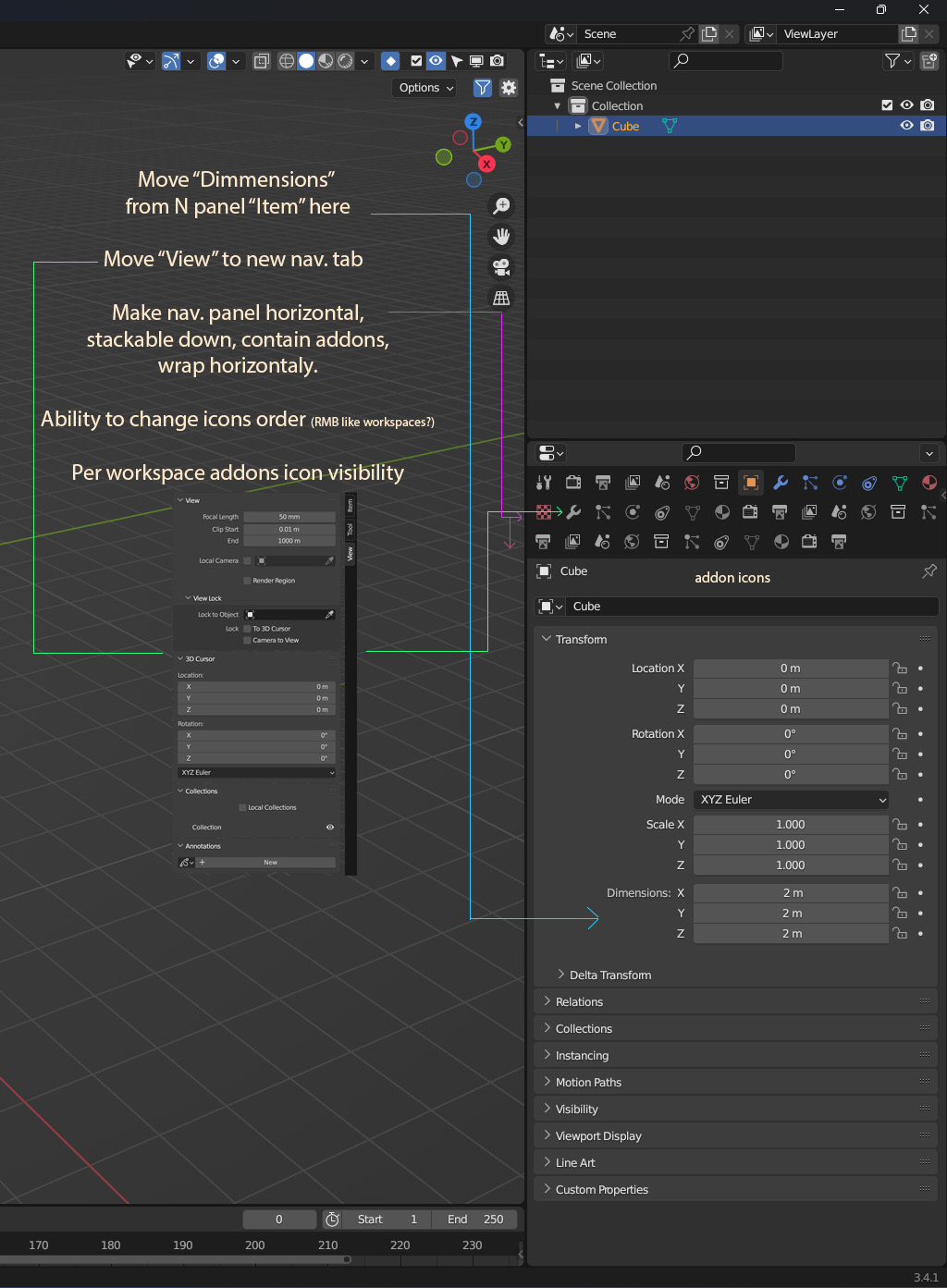
N panel madness need to stop. New home for Addons!
Benefits:
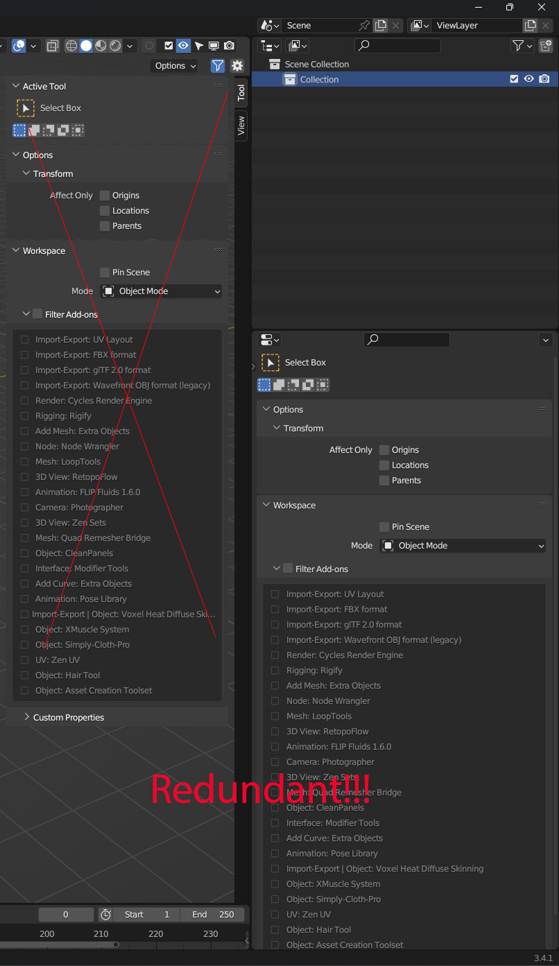
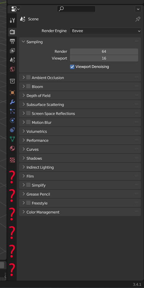
- N panel already have redundant things. p3
- Simple always better then complex, no need to have special n panel for thing that have better place to be. One place for all similar things is more intuitive (Property panel is not only for properties, there is already other things there like baking and voxel baking which is perfectly like addon panels)
- N panel can be deleted simplifying code and freeing up "n" hotkey or repurposed for more appropriate things.
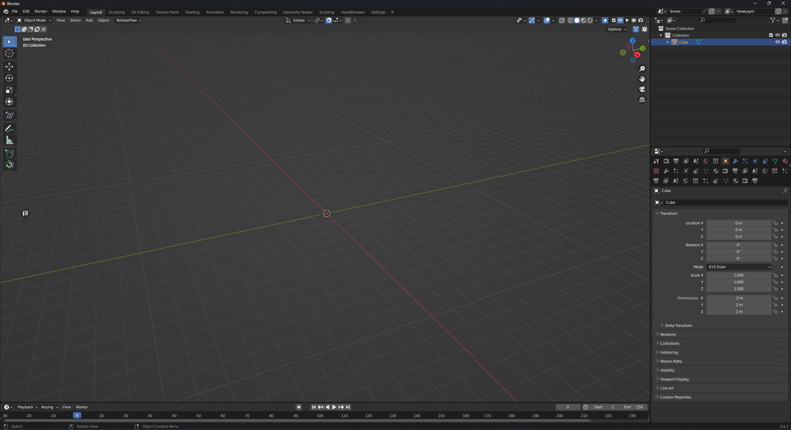
- UI real-estate, ITS EXPENSIVE. Properties and opened n panel takes a lot of horizontal space together.
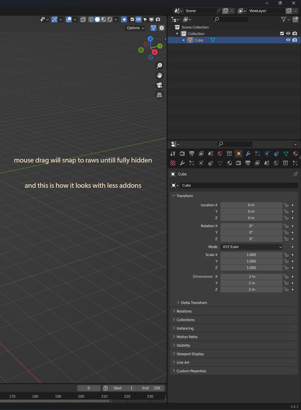
- It is unlikely vertical properties tab will be filled to the bottom without addons taking a lot of horizontal space that is more valuable than vertical because of ability to scroll. p4
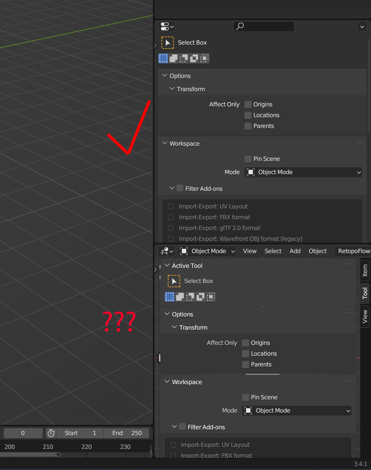
- Properties panel is more flexible with positioning. (Difficult to have n panel addons below where properties panel currently is for example. p5)
| p1 | p2 |
|---|---|
|
|
| p3 | p4 |
|---|---|
|
|
p5
19 Comments
Moving the mess somewhere else doesn't fix the mess.
Moving it where its needs to be does :)
Where it doesn't need to be is forcefully as new new tabs of the porperties editor. An addon maker should have the ability to make tabs there if they want to tho.
Concerning yourself with worse old ways leads to stagnation. There is always changes that force addon makers to adapt like api's updates, feature deprecation, BENEFITIAL UI CHANGES etc. ;)
You claim that everything in the sidebar "needs" to be migrated to the Properties editor, but that doesn't make it true. Could you elaborate on that please?
There are strong arguments against it. To name a few:
They are not meant to do the same things.
You argue that, some elements are already present in both to begin with.
IMHO, there is some cleanup to do, but it's overall not a bad thing, partially for the later point.
You could also argue there doesn't need to be such separation to begin with.
I'd say it's a nice flexibility that avoids having "everything in one place.
The sidebar is UI vs UX efficient
There's a constant fight between UI and UX. You can literally put everything in one place to save space, turn every title text into a 16px² icon, but it makes the user experience horrible. If people spend more time trying to read the UI and clicking everywhere to access simple things you need often, the UI is failing the UX.
The sidebar, when not overcrowded, is an example of good relationship between UI and UX.
Yes it can be overcrowded, yes it contains things accessible elsewhere, but the point is the quick access of it.
That's one of the reasons having things like the active object's coordinates there makes sense. Sure, you have them in the properties editor already. But on the user experience side, being able to have just a little corner of your viewport with these coordinates instead of opening the full properties' editor allows you to maximize the viewport on screen and have a distraction free experience.
It saves screenspace
In other words: You can work without the Properties Editor a lot of the time, and quickly invoke the sidebar when needed. You can even Fullscreeen the viewport and stay mostly like this for hours and still be able to work just with that little sidebar that i
For anyone who like to work with a fullscreen viewport or care about screen space, this sidebar is a bliss.
And yes, I do mention screenspace.
This is a flexibility that the properties editor alone doesn't offer.
As an animator, I love not being forced to sacrifice a chunk of my screen for a properties editor. Most of the time the sidebar is enough, and i keep it hidden until i need it. Allowing me to use my screenspace for other things.
Sculptors can literally work fullscreen for hours thanks to that sidebar.
Even if you do need the properties editor: if you also need anything the sidebar can expose, it's often better with the sidebar for the above reasons. No need to open an additional properties editor if you want to model with a modifiers list.
It is not and has never been "the place where addons go"
There are exceptions, but it is foremost meant addons that operate mainly on the viewport.
Your claim that "Addon creators put things in n panel because everyone does so they copy" is funny because, well... Not everybody does, and maybe those who do have a reason other than copying? Like maybe they just follow the BFs recommendation, or just what seems logic for the UI's purpose?
A good example is Rigify: the only parts in the sidebar are the RIG UIs, which is meaningful and insanely handful there.
All the rest can be found in viewport menus or under the Properties Editor's Armature or Bone Data panels when relevant.
Node wrangler: in the node editor's menus and sidebar. Because, where else? It's not a bunch of properties for scene data, and it doesn't impact other editors, so why even get out of these editors?
If you find addons that you think don't use Blender UI's properly (within the limits of the API), the culprit is... The addon's dev.
This whole stupid issue and years long debate could be solved by simply allowing the tabs to overflow into more than one column. It's an issue even without having any add-ons installed . As resizing any viewport below a certain threshold causes all tabs in its sidebar (N panel) to have clipped or non-visible text. It would be a very simple and logical fix if people could just stop arguing about it
"UI real-estate, ITS EXPENSIVE."
Agreed, but many people prefer to dedicate some of that real estate to dialog boxes that offer realtime access and information.
Parallel example: You can hit TAB in Photoshop and remove all the toolbars, and see nothing but the image. In 25 years, I've probably used that feature.... once?
No thank you, it's already bad enough that I don't have a persistent PRS coordinates toolbar/palette. Your suggestion means I would have even LESS information on the screen at once.
Better not to mess with properties editor tabs. This editor is specific to changing settings of datablocks of the scene. They are only a few, for each datablock, nicely organized in the order of hierarchy. These are fundamental for blender. In contrast, addons are used for special workflows or edge case functionality. Addon makers have the ability to place their addon menus anywhere. They may add them inside those tabs (Though i think they should have the ability to make new tabs, to be honest), or they can choose to put them in the N-shelf as that usually makes the most sense, because these addons are specifically made for functionility within the 3D view editor. The N-Shelf tabs should soon get better by allowing the user to scroll, btw.
Things need to be messed with to make them better.
If the problem you're having is "Too many tabs in the N-shelf", then obviously, merely moving them elsewhere, to the properties editor is not a solution. There is a very clear solution to it: Filter your addons for your workspaces. You do not need 100 addons enabled for the task you are currently doing.
But it IS a solution. Having addons have only icons and placing them in a grid fixes a lot of issues. AND too many is not the only problem with n panel. And my suggestion includes per workspace filter but its much more robust where you don't need to concern yourself with filtering if you don't want to, it can handle huge amount of addons easily. Also it simplifies things where blender devs can even delete n panel and have more clear and simple ui.
"But it IS a solution. Having addons have only icons and placing them in a grid fixes a lot of issues." So, what you want is icons in the N-panel. That I agree with.
Placing menus for addons, which are for the 3D view, not in the 3D view, makes no sense. Would you place the menus for the node wrangler there too?...
"The N-shelf is the better alternative."
"It's the best place for most addons, as they are made specifically for the 3D view editor. Which is why they are there. Addons that are not made for the 3D view editor are typically not in the 3D view editor."
Already answered most points but: In what way Flip fluids and Physics tab so different? Couple buttons that do things? Properties have them too like baking and voxel remesh. No reason to make it just for properties when it already is not
If your mouse is in the properties editor, then it is not in the node editor.
"Yes, yes i would, just make it context aware like it is now."
The properties editor has a very specific purpose. Notice: There are barely any action buttons there. It is context-aware to specifically the selected datablock (Scene, view layer, object, material, world, texture, object data). The properties editor is for changing the properties of those data blocks. If that's not what you're doing, and just modeling/sculpting something in the 3D view, you can just maximize the 3D view (Shift+Space) and do everything you need to do.
The one black sheep tab that currently is there, but shouldn't be, is "Active tool settings". Don't let a black sheep fool you that the properties editor is for "any or all properties of anything"... It is not. I agree that having the active tool settings there is redundant, but you are wrong about which instance should be removed. (More on that here: devtalk.blender.org/t/active-tool-settings-gui-papercuts/27405 )
Properties of Addons are often editor specific. Often, they are not just extra properties for data blocks (Which is when they should be in the properties editor). They are for tools, actions, or overlays, that work within specific editors. Therefore, there is no other place they can be, but in them. Removing the "N" shelf would just remove the only logical place many of them can be in...
As an example: There is this addon I use that lets me spawn assets of trees/plants. If the buttons of this addon moved to the properties editor, it would make as much sense as moving the 3D view editors' "Shift+A" menu there. Or, I have this addon that displays an overlay of keys pressed in the 3D view. Moving the settings of this overlay there would make as much sense as moving the whole overlay menu there. This just doesn't work.
Anyway, I am strongly against the proposal of forcefully migrating all editor-specific addon settings to the data block properties editor. This is not what it's for.
But here's what I'd approve:
The addon devs should have the ability to freely create new tabs with custom icons in the properties editor for whatever reason they like. They currently can't. The addon devs should have the ability to place an icon, instead of text, as their tab in the N-shelf if they want. I don't think they can.
Addon developers do not have to follow rules of how the blender GUI is organized if they don't want to, though that would be nice if they did... Many times, I think they just don't think it through and make a bit of a mess. Often, they just place their stuff in the "N-shelf", though placing them elsewhere would make more sense... For example, the addon that adds the "Hotkey pressed" overlay is an overlay... so why not place these settings in the overlay menu? They have the power... Though, to be fair, that menu could get pretty darn huge if every overlay addon placed its settings there...
Being able to filter, or letting the user chose in which tab to store addons, is already a better solution and an adaptive one.
It's already the case. You have to follow the rule only if you want your addon to be shipped by default with Blender. Otherwise, it's free game. Although, unless you are above the average addon dev competence, you are limited by BPY's abilities.
Last time i tried to do so for my own addons, I gave up after hours of trying.
I think there are ways, but they seemed hacky for me, and ultimately unbeatable for my skill level.
IMHO in addition to more flexibility for the addons devs, there should be more flexibility for the user.
I.E. Some addons allow choosing in which tab to store their panels, but this has to be programmed manually for each new tab.
I think the API should allow that by default, without the need to program significan extra code. If the addon makes a top level panel, its parent tab should be editable, even its name!