
Toolbar tabs show full label, can be reordered
Though I think the UI of the Toolbar could use a full re-work, in the short term:<ul><li>I think it would be beneficial to make it so that the toolbar tabs show the full label of each tab, instead of truncating them to make all the tabs visible at once. If you have enough add-ons installed, your tabs can all lose their labels completely, making it a nightmare to find the Toolbar you're looking for.</li><li>In order to accommodate the fact that the tab labels would be longer, the bar as a whole should be scrollable (similar to how Adobe applications handle it). Simply click in in anywhere on the tab bar, and drag it up or down. Possibly also bind it to a scroll wheel shortcut (though I know scrolling on the tab bar currently scrolls through individual tabs).</li></ul><em>*<strong>NOTE</strong>: the below image is my Toolbar on my work's 1920x1200 monitor. Most people have less vertical screen space to deal with.</em>Additionally, I think it would be of great benefit to allow the tabs to be re-ordered. Right now they seem to be ordered by the defaults within Blender, and then the order in which add-ons have been enabled
Instead, I propose a shortcut (something like CTRL+Drag) on a tab to move it within the tab order.
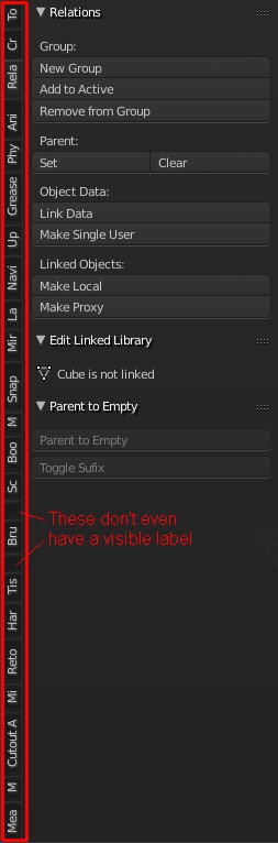
9 Comments
Not directly related to this proposal, but add-on developers really need to be encouraged to integrate into Blender and use it's existing tabs as much as possible. If they did that, we'd run into fewer scenarios when tabs overrun.
To add to this, any add-on dev using tabs should checkout the Tab Guidelines: wiki.blender.org/index.php/Dev:Doc/Projects/UI/Tab_Guidelines
I agree. But unless there is some way to force the add-on devs to adhere to the guidelines, there are always going to be those who do their own thing. Like I said in the proposal, this would deal with the problem for now until a better toolbar UI is developed.
There are some ways. For instance, most add-ons are not accepted into master (to be officially distributed with Blender) unless they use existing tabs. Also, users here also have some influence. Make bug reports and emails to add-on developers to let them know that they should be following the tab guidelines... and that not doing so is making it harder for you to work in Blender.
Instead of scrolling them, how about we just make the first n tabs (or first k -pinned tabs) always show, and then all the others are relegated to a popup list accessed via a "..." or "hamburger/triangle" button at the bottom of the tab strip?
This is something that needs improved for sure. Personally I've always liked Safari's method for handling this, where the active tab is mostly drawn, while further away tabs are smaller and smaller. The key feature, though, is the ability to scroll through the tabs: cl.ly/fV0V
Actually I'm quite surprised, that this haven't been solved in 2.8 yet :/ I thought it would add another label bar whenever it runs out of space...shortening the labels does not make sense. Also it would be very nice to have possibility to customize colors on most used ones and change order/position:
I TOTALLY AGREE. As it is in 2.79 I end up with many small tabs and i just have to click each one until I get to the tool I want.
I have used this tool with 278c as a workaroud
blenderartists.org/t/addon-ui-tabs-change-category/649585/68
But as I said it is a work around one that I am really caution with right now.
There should be a way to organize the toolshelf tabs to the user's taste.
A great idea! That scrolling feature already exist for window Headers, but horizontally. I think this code could help to implement it vertically.