
Outliner - option to show some restriction toggles only on collections to reduce clutter
Usually you don't need to toggle that stuff for individual elements, just collections. All those white icons are clutter and restrict visibility.
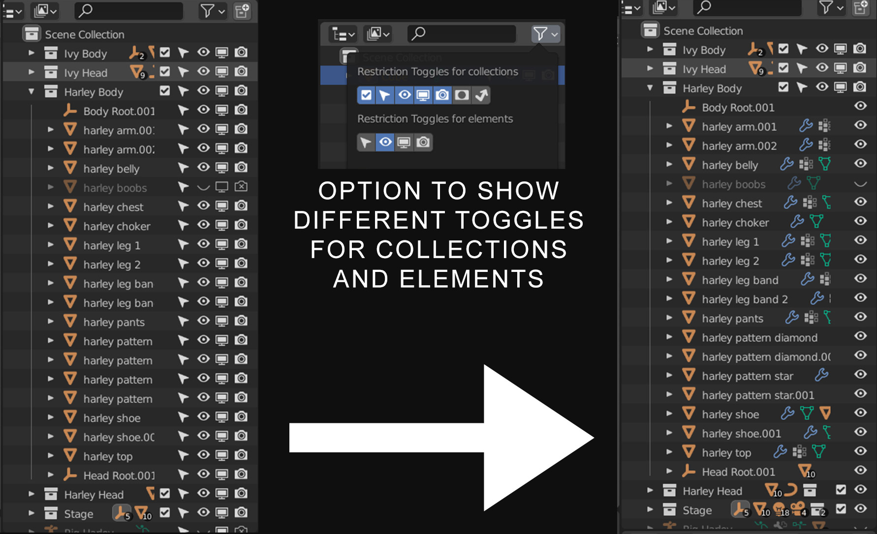
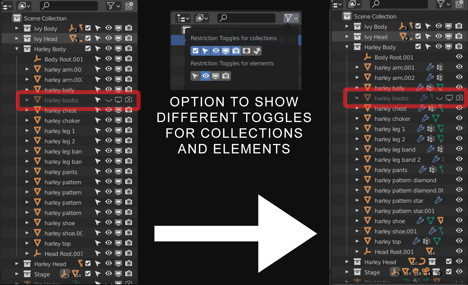
When an element has an individual toggle instead of inherited from the collection: show the icon for that toggle, but only for that element.
2 Comments
I think I like this?... What happens if you have one of your elements unselectable? And you then switch off the selectable icon for all the elements? Does that mean there's a hidden unselectable element in there? Or do they all get uniformly selectable again (because the parent collection is selectable)?
I ask because while this seems like a good idea, there's a simplicity to what's already there which is valuable.
Personally, I would reduce the clutter by not having the renderable and viewport visible icons off (so you only have visible and selectable on). I dunno, what do you think? What am I missing?
If an element inside the collection has something toggled individually, then the icon(s) for that toggle should be visible next to that element only. I'll upload a new image to show what I mean.
Personally I don't like the convoluted visibility system Blender has and would rather have just a single "hide" option, but as it works right now I need at least Hide and Render, because "hidden" objects still show up in renders :/
I'm sure the current system is useful for large projects, but it's just confusing for me.