← All ideas12 Jun 2018masinisa89OpenGeneralUser Interfacemasinisa89DraiseLuis.BurdalloOskarSunbeamabdulrhman.asamiangelbpinedabnzshperticaratilucianoogiermpaulsalvadortxozuorion
On large monitors the top bar wastes a lot of unnecessary space, leading some users to want to hide it
When the top bar is hidden, there are some controls that users cannot easily access.
Changing from Data Properties to Tool Properties is too much of a hassle
Command Settings dropdown in the Top Bar was too far out of the way, and too much work to engage, always requiring a click to access
When users have a long list of custom brushes, the toolbar makes it hard to quickly access them all
For this reason, we want to make some changes to these features.
[...]
The new philosophy for the Top Bar, is that Blender should be fully useable if it is hidden, so that users with large screens can hide it away without issues.
This makes the Top Bar simpler too: It now only contains Active Tool settings.
l
lsscpp
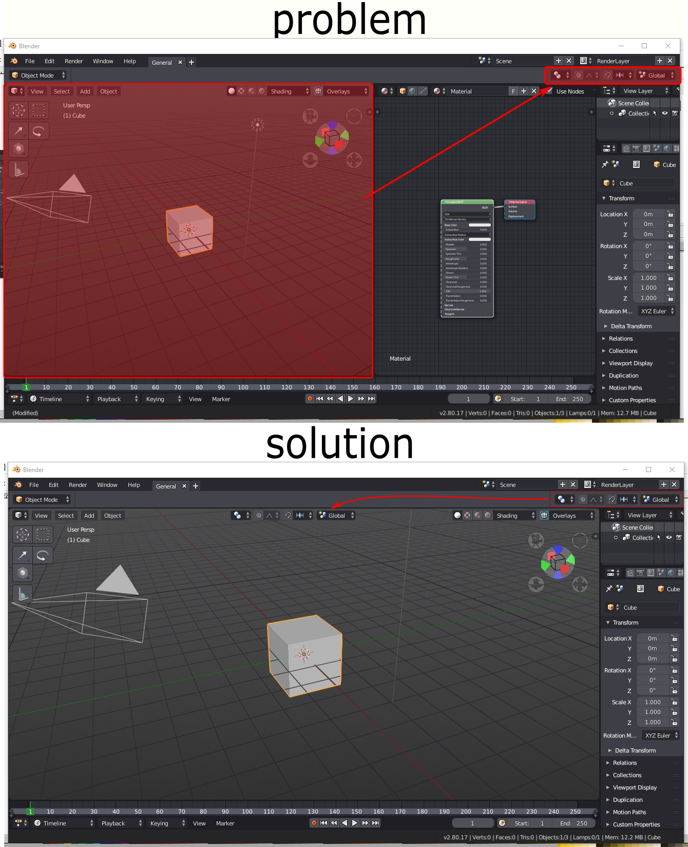
ok, but if you apply your solution to the upper screenshot you lack space

3 Comments
Yes, everything to the top right that has anything to do with the viewport feels disjointed and is a long reach.
Already done in the current code (it's a homemade build, maybe it will be available next monday's builds):
Also, according to this dev task :
ok, but if you apply your solution to the upper screenshot you lack space