
Make who voted buttons take less space on RCS
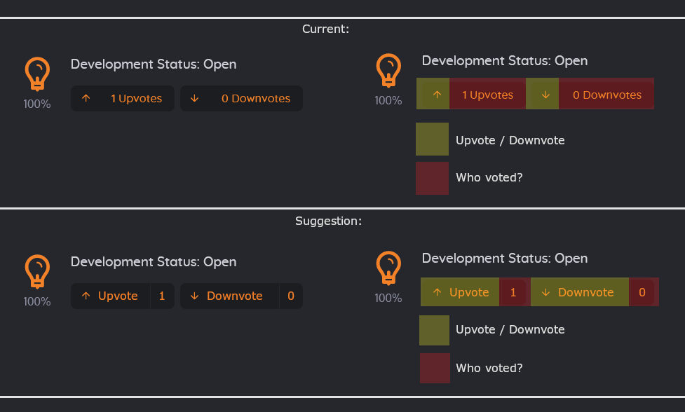 I don't think looking who voted is a more common operation than voting... And I keep pressing wrong buttons because they take up all space 😅
I don't think looking who voted is a more common operation than voting... And I keep pressing wrong buttons because they take up all space 😅
4 Comments
I don't think that's the issue. The main one is that the current UI looks like it's one unique button while it is functionally not, it's misleading UI.
It could be as simple as the previous up and down arrow with the total sum of votes value in between, and clicking it displays the votes details.
Now I often cliking to up/dn vote but counter votes due that btn is longer than voting : )
Thanks for the suggestion!
We just implemented it, marking this as done.
Add adding here other bug: imgur.com/a/7quOgvH