
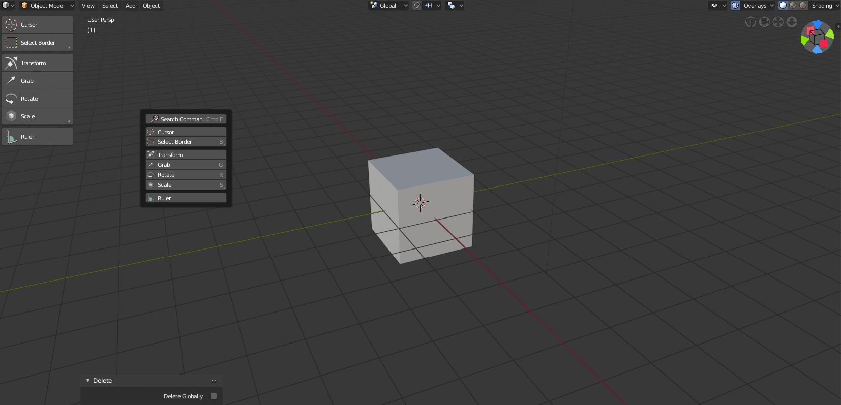
We should get rid of those large toolbar icons since they are already accessible through the SPACE key.
I find it pointless to have what is already accessible within the cursors reach, making up more space, so I was thinking, why not bring both toolshelf and properties together, on one side(left?) With the two tabs on top which let you switch between them. Giving us more space. What do you guys think?
2 Comments
we should get rid of that space key toolbar is useless, and the regular one should be down to one row by default
Just hide it with
Tor scale it down.