
Splash screen mockup
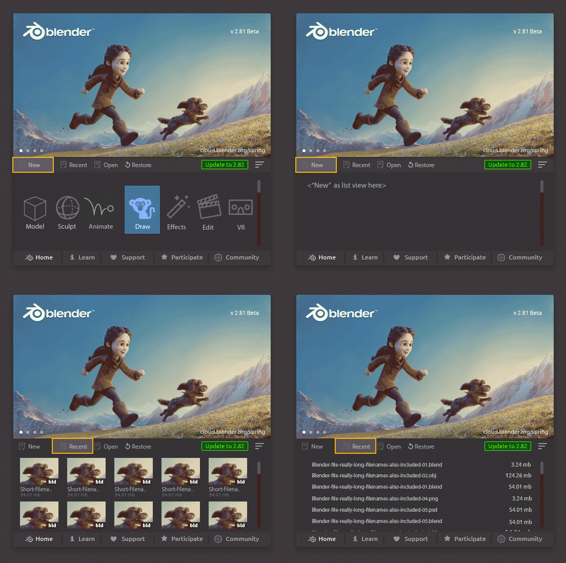
Here's a random revamp mockup about the Splash screen.
It could be more appealing especially for the noobies. There's a large area with bright color under the icon. Maybe it would stand out in videos and such, easier to recognize & memorize.
Names of the New Files (Application templates?)
- More descriptive ("General" isn't informative)
- Action-based (verbs)
- Consistent icons
It would be better to have them grouped & separated slightly (15px?) in the mockup: Modeling, Sculpting in one group etc.
Here's GIF
share.getcloudapp.com/NQuexAxz
PS. It looks childish with those icons, should be professional looking.
16 Comments
Don't hide the recents behind another click.
* @cmbasnett * Nice one, I have to make this better, so that there's 3 scenarios: 1st launch (setup), second step in 1st launch (beginner view) and 2nd launch > recents and such. What do you think?
Looks cheap. Just my personal opinion. Sorry I don't have much constructive criticism beyond that, just the overwhelming feeling I get. Maybe too much going on? Little bit of an eye sore.
* @rileybrown704 * agreed, looks goofy and childish to me.
* @rileybrown704 * No problem Riley, I think that's a great feedback. It is cheap & childish looking and there's certainly too much stuff going on.
This is also missing the setup splash when you launch B 1st time.
* @rileybrown704 * If I get this right, it looks cheap because it feels like one of those generic software that have nothing going for them, so they need to display everything they can do on the splash screen.
I see where you are coming from. Although these are somehow common on most 3d software's, I find the current splash screen more preferable. Much simpler and cleaner; also they included recent files in it. But let us see maybe some users might like this kind of splash screen. Can be useful to those who are new in blender.
* @johnpdelacruz26 * I like it but i agree that the recent should be on the first page as well.
* @Luciano A. Muñoz Sessarego * Great points, there could be an option to choose which view to show first. Recent view is more important than the "New" menu, but for beginners, this would make look things easier.
This would look better in the Blender 101 idea Ton wants to make, IMO.
* @bruno.souza.lino * This sounds interesting, can you tell me more about it?
there is too much going on in this mock-up, the default one is nicer because it gives you a quick access but i think they could add the tabs for other stuff, including the ones we get in the first setup(theme,spacebar....) that would be much better way imo.
* @Cobra * Agreed, great feedback.
All the things you showd become much like " louncher " not some" splash screen ". In this case I like Epic Loucher for UE. It contain all the comunity activities, news, spotlights, versions, upates, marketplace, plugins library, projects, etc.
But it's louncher - complex software thing. Not just some " splash screen".
* @IIIFGIII * Thank you for this one, I didn't know the proper name for it, will fix it as Louncher in the future.
Complex meaning that there has to be a big benefit for Blender users (beginners<->advanced) to even considering building one?
I don't see a "never show this again" button.