
minor change of interactive 3D gizmo
I really like it as it is now. Simple, clear, understandable. There is just one little tiny thing. :-) I just find the Y should be front-view and not back-view as it is right now. It's somehow weired now.
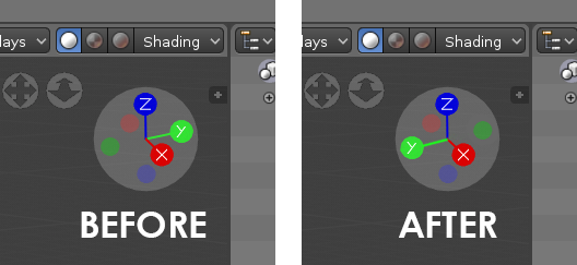
I really like it as it is now. Simple, clear, understandable. There is just one little tiny thing. :-) I just find the Y should be front-view and not back-view as it is right now. It's somehow weired now.
4 Comments
The way that axes usually stretch in positive direction is to the right (X), forward (Y) and up (Z). In your diagram either the Y would go to the back (negative Y would go forward), either X would grow to the left. Now you would have to argue that that is actually a little bit weird :)
@Okavango: Dear Okavango, thanks for your comment. Well there is the problem what looks correct and what works logicly. Right now it works like this: click on Z = top view, click on X = right view, click on Y = back view. So I always have to remember NOT to click on Y to see front view. But actually it would be easy and we both would be lucky, if we let it as it is right now but just name the left green ball with Y while let the green line showing backwards. Would that then be OK for you?
@bruno.berger: Ah, i get the problem now. Yes, it is a thinker...
I'd have to agree that this 'axis' oriented widget is not the best for the Front/Back/Left/Right orientation purpose. While your idea does sound logical, it does introduce an inconsistency with axis graphics and letters.
What if we were to leave it as it is, but introduce an option to have a custom shape in the widget, instead of axes? Something like the Suzane monkey head, or a formula racing car - they have easily recognizable sides and the user would easily switch between them..?
@Okavango: Hmm, I'm not quite shure, I must see it. For sure I need the letters XYZ to recognize in wich direction i have to move the object. But he, if it stays like this, it is also OK. I think i can handle it and get used to. :-)