
Highlight Active Camera
It would be time saving to see on the outline which Camera is active.
Any visual hint on the icon would work.
It would be time saving to see on the outline which Camera is active.
Any visual hint on the icon would work.
9 Comments
Just to be sure, by "active" do you mean either
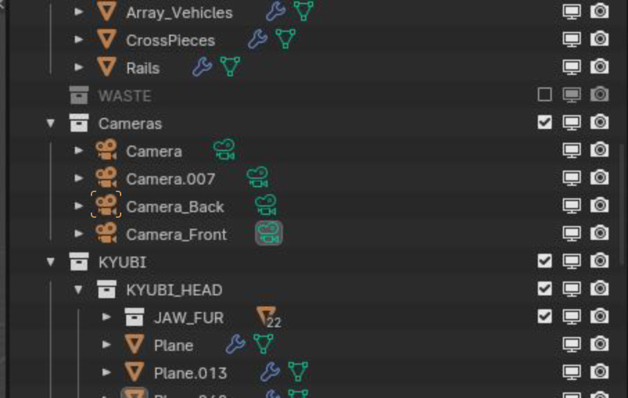
The render camera is shown in the Outliner by highlighting its camera data icon in Grey, whereas the Active Object is shown by highlighting the Object's icon. It's a simple non-invasive visual cue.
-L0Lock- it's unfair to call this thread done, since you didn't read my last reply. Please understand my point: the active object is highlighted, agreed; the camera object data is highlighted, WRONG, since you don't set the object data as active camera, but the object itself, try yourself. In fact, you cannot share the active camera as an object data by different objects.
Do you agree on this? Please try yourself, and see what you set as active camera
So, I insist on my initial proposal, you should give a slightly different icon for the active camera OBJECT, NOT the object data
I in fact did read the whole thread, then asked you a question to clarify and enhance the discussion. But nothing else. 🥹
I don't have moderation rights to change anyone's post here, and I am not a dev on Blender. Though, I would like to know what led you to make these assumptions, so that I can fix them for the future.
Back to the actual topic, I guess now that you do mean "render camera" precisely?
If so, I think we have to consider readability:
The corner outline you put in your mockup isn't that readable at normal display size, and I would guess to be even harder to read when combined with the selected/active visual cues.
(Which maybe explains the current highlighting of the Camera data: even though accurate to the data structure, it is a nice compromise while waiting for a better solution?)
Perhaps something simpler could be done, like just adding a "render" label?
I've been rude indeed, I was just upset for calling this done prematurely, and more important I thought you closed the task. Honestly I doubt that any dev would look into this even if will be something useful to ponder on. I'll be as polite and objective as I can.
I do agree, highlighting the camera data is a compromise; being the rounded square the standard way to represent active objects, they couldn't use it to represent active camera on the object icon.
I think that the most effective and coherent way to highlight the active camera is to add a visual hint on the object icon.
The sketch that I made is not the point, it could be even a dot beside the camera. This way you can easily spot the active camera even when you shrink the collection in the outliner.
The whole point is, at this moment, it's hard to notice the active camera in the scene and it's misleading to highlight the camera data.
Maybe I should propose another RCS idea after these assessments. What do you think?
no need to make another post, you can edit that one and it avoid duplicates and messy threads search.
The rounded square overlay of the object data icon is aready the visual hint for the active camera.
I've never noticed that. Maybe it's too feeble; I would add a visual hint on the object icon instead of only the object data. Thank you for the advise
Just noticed that it's an error that the object data is highlighted, since object camera can be active, not the object data. Should I report this?
the background rounded square colour of the active object / selected camera should be another colour than the "text" colour to make it more/better visible.