
New separate ribbon header for blender (optional feature and not compulsory for everyone)
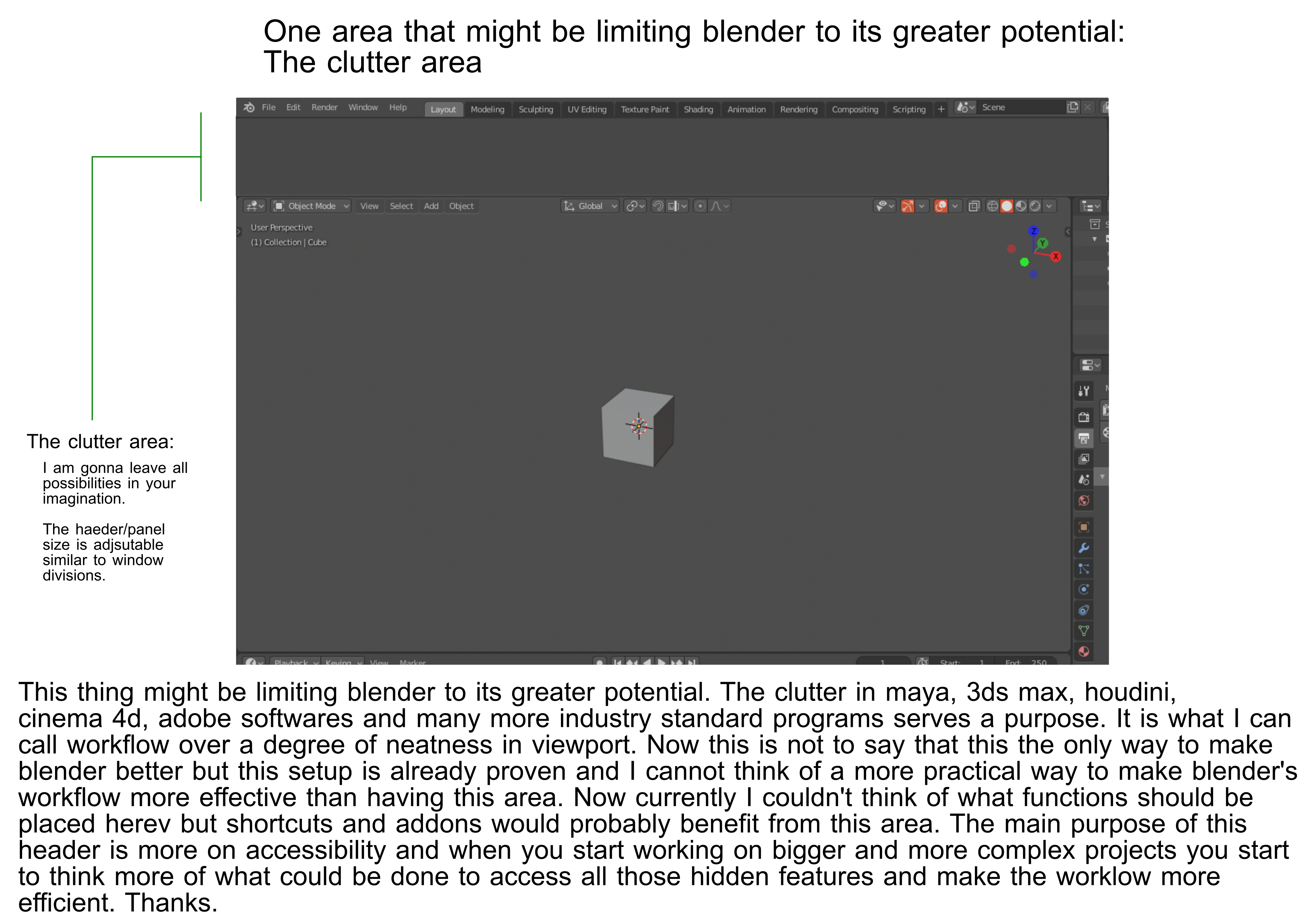
Hello guys. This is no way trying to be negative but I would like to propose an idea of how can blender utilize the hidden header on the top viewport and benefit the software. With all respect to the users who doesn't like the header or doesn't like any clutters at all, I hope you can understand that this is necessary and it cannot be avoided and can only be minimized. I understand the notion of adding messiness but I believe you get what I am trying to explain. That is why I would like to transfer the header to the top portion of the window and be separated to the 3d viewport area.
This thing might be limiting blender to its greater potential. The clutter in maya, 3ds max, houdini, cinema 4d, adobe softwares and many more industry standard programs serves a purpose. It is what I can call workflow over a degree of neatness in viewport. Now this is not to say that this the only way to make blender better but this setup is already proven and I cannot think of a more practical way to make blender's workflow more effective than having this area. Now currently I couldn't think of what functions should be placed herev but shortcuts and addons would probably benefit from this area. The main purpose of this header is more on accessibility and when you start working on bigger and more complex projects you start to think more of what could be done to access all those hidden features and make the worklow more efficient.
Lastly the header would still be an optional feature and can be opened or accesible with a button or hotkey. Regarding the connectivity of the header along with all the window divisions; if there are things that I might have missed that might make it hard to work; I would be nice if you guys would let me know or be aware of.
Thanks.
11 Comments
As for the suggestion itself. The best positive for this style bar is that it basically removes the necessity for every ui window to have their own n and t menus. Which saves space. One bigger bar at the top vs many side menus for each window. Although the strength for the current system is that you can have your specific tools available for each ui window.
I think it might be good for everybody to download and try one of the older blender versions which had ui something like this. Why was it replaced and could the same idea be done better? One of the good thing the current ui has is that each window can have their own set of tools available all the time at the same time for totally different things. With any one big panel you either need to make it content sensitive or you need to manually browse it to get to the correct sub menus where your tools are. Which could be slow. But it could be well organized.
Of course browsing ribbons style visual ui is a lot faster and intuitive than browsing drop down text lists so I don't see it a downgrade in itself in speed. But if you take away the n and t panels it becomes slower and faster at the same time. Faster and better than text based dropdown lists but slower than n/t menus.
I think blender took the right steps with 2.8 especially with the right click menus which is 1000x better than before but tool discoverability and tools being hidden behind text based drop down lists is still an issue (0% discoverability) and more work should go into making the tools available through content sensitive menus with visual cues and icons instead of lists of text and this kind of top panel (ribbons or something else) sounds like one possible solution at the very least.
* @o7216059 * Very true about features hidden behind drop-downs and nested menus. I'm being surprised all the time by the industry-standard tools Blender has that I just didn't know were there.
This is a good possible solution. I don't think they'll go implementing any major changes interface-wise anytime soon though, since 2.8 was such a paradigm shift. What are some ways we can reduce the chance of tools being hidden? Blender is drop-down menu central, with a lot of tools lacking icons and designated spots in the interface. It's hard to associate with tools that are only character strings. The ribbon on 3DS and Maya do indeed look accessible, but are a major undertaking to implement. Maybe an addon that adds an extra panel type like the ribbon that's context-sensitive?
A lot of micro-proposals could come from this.
* @Logan Preshaw * I'd really like to see categorization and hierarchization the current tools, have a tool search like in ue4 which shows this hierarchy and then use this hierarchy to create tool palettes and menus that are visually logical and intuitive to browse. Blender currently categorizes tools based on what you need to have selected before initiating the tool (mesh, vertex, edge, face).
In 2.8 this was expanded by making some of the tools content sensitive using this hierarchy which was a bad decision imho. In vertex select mode for example the default bevel tool is vertex bevel and not edge bevel for example. Even though edge bevel and vertex select mode are both the default options users use and expect. But blender overrides this with its unoptimal categorization which leads wrong content sensitive outcomes because the hierarchy is based on selection and not outcome.
The example of the opposite kind of categories is used with modifiers which are listed based on their functionality and not pre-selection. It works somewhat well for modifiers and for sure would be an improvement for tools as well. Of course a lot more categories are needed and I think a tool should be able to be part of more than one category.
* @o7216059 * Totally agree with some points made here, and it's a refreshingly alternate viewpoint. The bevel tool example is a daily frustration for me. Maybe take a look at what "smaller" proposals can come from this ideal? Big proposals with huge changes tend to scare people away or are brushed off as too ambitious.
At the end of the day, there's always the possibility of building an alternate branch, addon, or even entirely new software based on Blender's source code if your ideas see too much pushback.
This is called the "ribbon" by industry standards, coined by Microsoft when they refreshed their office suite. I have not used 3DS/Maya extensively and can't speak to the usefulness of the ribbon in 3D work, but it does certainly have appeal. I quite like the implementation in ProjectGANTT, Word and Apple's Pages. I think one of the issues Blender faces is how simplistic the left-side toolbox is. This could be considered a replacement that allows for an easy read of all available tools and settings, but Autodesk's software are not as shortcut-dependent as Blender (from what I've seen).
It lowers the entry floor for beginners, but at the cost of yet another panel. This is a pretty major change and would need to be heavily reviewed and considered by the dev team. They did toy with a header in 2.8 for a while, but eventually removed it. To be honest, I quite liked the header and prefer it over the N menu. Not sure how well an entire ribbon would fit into Blender's workflow though, or the necessity of it. Modo and 3D Coat seem to do fine without one.
yeah, i dislike the entire concept of a "junk drawer". it's one of the worst features about modern software development IMO and it reeks of lazy design.
* @testure * I guess I have to think of another way. -1 speaks a lot. Thanks for all the input you guys shared though.
* @johnpdelacruz26 * Don't get too depressed about the -1 comments. The ribbon idea has been talked about many times in the past just like general ui ideas like this. It is more about people being tired of seeing it come up again with nothing new added to the topic ("add excel like ribbon menu to blender"). See here for example: blender.community/c/rightclickselect/CGcbbc/
Look at this amazing ribbon. When I today see guys who working in 3D Max for me it looks like they look at the model "through a little loophole" of tiny viewport. Most of screen space eaten bu unused stuff.
* @IIIFGIII * Respectfully. This is not a fixed feature and this is just an optional one just like the current one which is defualtly hidden.
I hope you guys wont downvote this just because you have a bad experience about it. Not voting it would be probably fine. Not having ribbon would work greatly to smaller peojects and when this one is not implemented, in my opinion it would be harder for blender to have aworkflow that can be used as a standard 3d development without the use of other softwares. I would like to remind everyone that this will not be shoved in your face. This is more of an option for poeple more focused on efficiency. The great thing is you can still hide this with a hot key or button similar to the properties bar and tool bar which can help you see your models in a much larger window.
The main focus is not more on smaller projects but on medium to larger aspects of it. I understand that some of you wants to see your 3d designs somewhat near or closer to full window but that wont be realistic when the task becomes too big and complex. Even an additional monitor wont work because almost half of blender's function are somewhat hidden or hotkey driven which if you add all the clicks and navigations this would technically add another amount of task and time which should have already been done just by clicking along the ribbon header. This may result into a much cleaner viewport but a very slow production. I guess some smaller group of creators won't mind it but what about on the mid to bigger scale companies or projects?
I hope you guys wont take this negatively. It is just so difficult to push this feature which I believe is an essential part of an efficient production software. From what I have envisioned what blender may look like in the future is more like this; a software that cater's not only to smaller scale of projects but also larger scale projects.
Thanks.
* @johnpdelacruz26 * I agree the downvotes are a little much. However, I disagree that a ribbon is entirely necessary for a productive workflow.
I haven't seen too many use-cases for the ribbon beyond showing context-sensitive functions. I think if there was more work done on the UI that we currently have to correct button hierarchy and introduce more icons or reduce drop-downs, Blender could achieve similar usability.
I don't like the "The other guys do it so let's not it" approach that Blender has had in the past, but that's becoming old news. I would be happy with an optional ribbon, but at this point it may be too much work that could be put into more inventive solutions.
Modo may be a good model to shoot for: It has an excellent and fast workflow. Maybe there's something there that can become a proposal? Blender is also a unique beast. What could we propose that would be more in-line with that line of thinking? Whenever I have seen someone work in Maya/3DS, it always seemed a little cumbersome, and it may not be good inspiration.