
Blender UI + Manipulator Gizmo - Updated!
Hi, everyone!
Blender is an essential part of my daily workflow and for a long time I have been having some ideas that could improve the UI.
The Manipulator Gizmo
I use the Manipulator gizmo mainly with two basic functions, move and scale , and usually avoid the use of the 3 way combo because the rotation arcs are large and it makes the Manipulator gizmo too busy to the eye and when you have a complex object to work with, the last thing you want is a complicated tool.
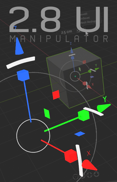
Here is my proposal for the combo
 The Manipulator gizmo could have the rotation arcs smaller to make this tool compact and simple, so you can use the three basic functions,
grab, scale and rotate
, at the same time.
The Manipulator gizmo could have the rotation arcs smaller to make this tool compact and simple, so you can use the three basic functions,
grab, scale and rotate
, at the same time.
The three functions coexisting in perfect harmony
 I downloaded the 2.8 built to see the Manipulator improvements, the Blender designers have been doing an excellent job. I like the current idea to have the
Trackball
area transparent and only when you want to use it is visible, that little touch is great.
I downloaded the 2.8 built to see the Manipulator improvements, the Blender designers have been doing an excellent job. I like the current idea to have the
Trackball
area transparent and only when you want to use it is visible, that little touch is great.
The outer ring for the View Axis Rotation is fine, but It would be nice if It also has some level of transparency and eventually becomes opaque when the mouse is over for a couple seconds.
I would like that the UI designers could consider add the X, Y, Z letters on the axis, that is an useful guide when modeling, of course, in case a Blender user do not want to see it, they could have the option to hide It in the system preferences.
The
Number Field Box
,
over the Manipulator gizmo
 We need an easy and direct way to see the transformation incremental info but
next to the gizmo
and in
real time
, instead of looking for the small information data somewhere outside the visual range of the selected mode we are manipulating.
We need an easy and direct way to see the transformation incremental info but
next to the gizmo
and in
real time
, instead of looking for the small information data somewhere outside the visual range of the selected mode we are manipulating.
The idea to see the object information comes after seeing some of the Cédric Lepiller and Masterxeon Addons where they use similar options to control the transform increments in a very easy and graphic way. The CarverMT Addon already use something similar. A Number Field Box like that should not be a problem.
The
Snap Tool
 This useful option could be like a
Radio Button
next but independent of Number Field Box, and could be turned off in case you do not want to have it there.
This useful option could be like a
Radio Button
next but independent of Number Field Box, and could be turned off in case you do not want to have it there.
The
Addon Caller
 This could be a simple solution to resolve that there are some Addons that share same Blender hotkeys, or in other cases you need to create a specific key combination. I'm bringing this issue because I recently got a nice addon named
BevelR
, unfortunately it uses the [T] shortcut. This specific addon works basically when you select an edge to create a bevel, so it will be nice to select an edge and call the addon from a small menu. This could be some kind of independent Addon Menu. Of course, if you do not want to have something like that, It could have the option to be turned off too. As I said before, this options could be turned On or Off directly from the Overlays Tab or in the preferences panel in case you don't like It.
This could be a simple solution to resolve that there are some Addons that share same Blender hotkeys, or in other cases you need to create a specific key combination. I'm bringing this issue because I recently got a nice addon named
BevelR
, unfortunately it uses the [T] shortcut. This specific addon works basically when you select an edge to create a bevel, so it will be nice to select an edge and call the addon from a small menu. This could be some kind of independent Addon Menu. Of course, if you do not want to have something like that, It could have the option to be turned off too. As I said before, this options could be turned On or Off directly from the Overlays Tab or in the preferences panel in case you don't like It.
The
Navigator Gizmo
 This a very interesting tool because it is so simple and natural, also very useful, in special for new users. I saw some of the current proposals in this thread:
developer.blender.org/T54723
This a very interesting tool because it is so simple and natural, also very useful, in special for new users. I saw some of the current proposals in this thread:
developer.blender.org/T54723
Pablo Vazquez did some great ideas and I saw others cool proposals around. I think, from an artistic point of view, the Global Axis Navigator should not be so visually intense, we do not need something complicated distracting us. I would like to suggest a minimalistic approach with this tool, of course will be up to the UI designers to take a final decision on it, but I would like to propose a simple idea because the tool by itself is already intuitive, we all know why it is there and what it does, so instead of having a complex design, what about use simple small spheres or squares and the X,Y, Z info, but nothing more, because I think it really doesn't need more.
The new four
Navigation Icons
in 2.80
 It is very nice to have the
Orthographic View, Camera, Pan, Zoom,
functions available in the viewport. This tools could find it's well deserved place centered in the bottom of the main view.
It is very nice to have the
Orthographic View, Camera, Pan, Zoom,
functions available in the viewport. This tools could find it's well deserved place centered in the bottom of the main view.
Here is how the UI look with some of the changes.
 In the right of the viewport there is a column of gear shaped icons. I think that could be nice if you want to assign some of those great modeling functions, but which also are hard to map in a keyboard, for example, like [ Shift ] + [ Numpad7 ], which aligns the normal faces to the top view, or [ / ]
View Global/Local
, which isolates the object, or
View Selected
, which centers the active object in the viewport window or some of those functions that works with F1, F2, etc.
In the right of the viewport there is a column of gear shaped icons. I think that could be nice if you want to assign some of those great modeling functions, but which also are hard to map in a keyboard, for example, like [ Shift ] + [ Numpad7 ], which aligns the normal faces to the top view, or [ / ]
View Global/Local
, which isolates the object, or
View Selected
, which centers the active object in the viewport window or some of those functions that works with F1, F2, etc.
Keep in mind that not all keyboard are the same, and not all the custom shortcuts are easy to map, for example, I use a small Mac keyboard and believe me, it is hard to find the right key combination. A direct way to assign and select a function, which is part of your daily workflow to a small button could be very nice and handy no matter which OS system or keyboard you are currently using.
I hope this suggestions make sense to you.
Best regards.
I find this 2 proposals interesting
Align all the editors in a vertical column is a clever solution.
The graphic representation of the rotation with snap is great.
devtalk.blender.org/t/snapping-and-the-status-bar/713
3 Comments
NICE!!
I like the design. For the rotation arcs, I think I would like them at least 2x longer.
Besides that, everything should remain optional.
could you insert your images propperly so we can see them ? Here is the code :
example :

Gives :