
Modefier list changes
i saw that pablo is working on an Modefier list overhawl but i think it is more of a step back than an improvment of the curent modefier list.
for context
projects.blender.org/blender/blender/issues/111538
this is pablos proposal of adding a shader add menue style list wich will introduce more steps in to the proces of finding the modefier you are looking for, tho they will add a search funktion that would have same amount of steps to the curent menue style. But i don't think it could replace the curent method becose some modefier names are confussion to memorise wich would punish neuer users.
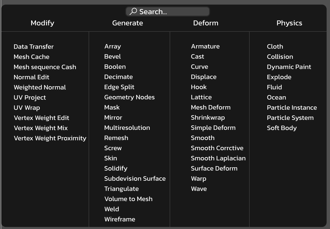
my proposal would be to have a small ui update to the curent modefier list and ui elements of that list to make it easier to find some modefier wich is curently very hard becose many share the same icon wich leads to confussion.
also the search bar should highlight the searched modefier so you can find it more easly next time (like darkening everyting that isn't curently searched by the user)
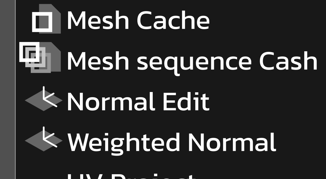 vs curent
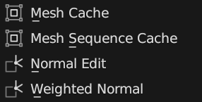 (non of this is final but it should give a good idea what i mea)
5 Comments
Thanks for your proposal, but the idea of a big wall of options doesn't scale well when users will be able to add their own modifiers. It also doesn't work with small screens.
i understand that it requiers more screen relastate but i think an add menue would slow down experienced users and new users and a search funktion when modefiers have complicated or similor names dosn't help ether with it
Experienced users will use search. Soon search will remember the latest search results so they will show up first.
New users will find modifiers more easily since the sub-menus will be more descriptive and we'll try to make them as similar as possible to other Add menus.
I do need to disagree, though one at first looks visually more clear, but it will take longer to search for inexperienced people who just want to add "triangulate" where it isn't clear if it is under the category of modefy or generate.
Also, the search function requires an additional click per action if you factor in that you first need to tip into the search for a modifier to appear.
I believe that the blender works well with the current modifier panel and doesn't need that many updates to be really good.
Yes, the problem with custom modifiers would exist and would be a way harder challenge if this part of the UI stayed the same, but for that, I propose a side button next to the "add modifier" button, which would also give a very clear separation from modifiers that are added by add-ons or Python scripts.
As I mentioned, categories will be renamed and expanded for clarity.
It will be just as fast, especially if you use the shortcut for the menu which is what most people will use (same way they use it for adding meshes).
Shift+AmirEnterTwo buttons for doing the same thing is not great. Also, it's not only add-ons or Python scripts, it will be Blender itself that will register custom modifiers once they are converted into Geometry Nodes.
Node Groups and Tools assets already integrate seamlessly. Modifiers are no exception.