
Add a quick search bar in the N plane please?
When you install too much addon
Your N plane will emmm...
I had to waste too much time to find the addon tab I need (May it need change to other location. This just a sample ui demo)
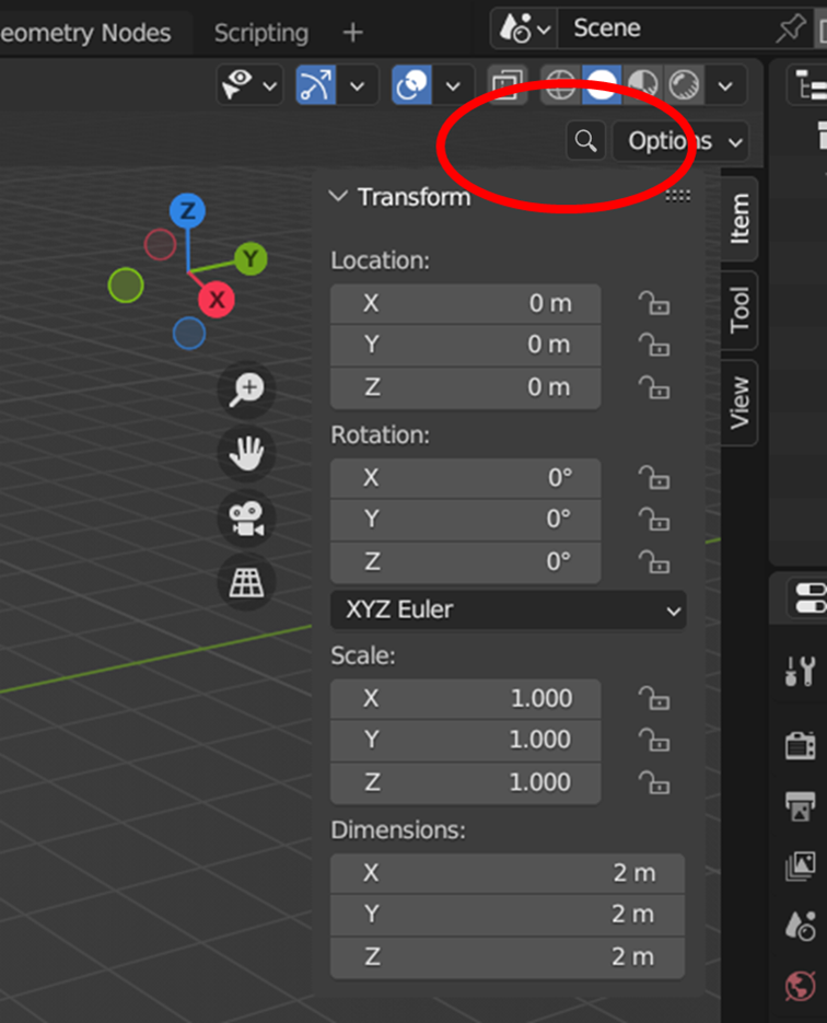
Input the key word and quick filte the addon you need
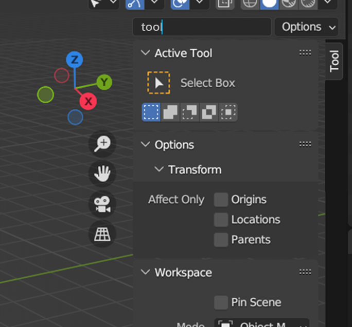
Just do it!
11 Comments
I think the position of the search should be inside the sidebar, not in the topbar.
Transform:
View:
It also needs a label next to it, so that the user understands they are searching only within the scope of the add-on tabs, and not the entire scene for an object or light or command.
Yes! It does look better. And hopefully it should work basically the same as the Properties Editor's searchbar, including the dimming/highilighting of tabs depending on the search results. That would help when searching for a specific addon's content ♥
I doubt this is needed. If the searchbar widget looks like it's part of the sidebar - similarly to the Properties Editor or the outliner's searchbar, it's already a strong indicator of its scope.
I wouldn't add labels as they'd take space for something that you learn the first time you use it. The same visual language is used in other areas so that label would only be useful that one time and then just a waste of space.
That being said, it'd be great for text inputs to support placeholder text like HTML inputs do. They allow to give some context without taking space. But that's for another proposal.
On further thought, I'm questioning why this needs to be search field, instead of a drop-down menu that would be populated automatically, and alphabetical order, of all the add-on names. Which of course allows you to pick one with a mouse click.
It just a sample ui demo. I know the mean you said.
I just auto sync the search bar and the workspace filter to achieve what I think
All right it has better way to achieve. Looks like the F3 normal search bar and properties search bar.
No I'm just saying, why do you want to search? Why is a search bar better than a list that you would just pick your addon from?
Because the list will become very very long also if you install too many addon. So it also need add search bar instead of only list.
Why not a vertical search bar? ;) Seriously now, is there any solution to have title bars, instead of vertical tabs? 3.6 is better with no overlaps but still the most horribly designed part of blender.
Open one addon in a new separate window. It looks like the vst does in the music software?
May be looks like this?