
Modifier Header Enhancements
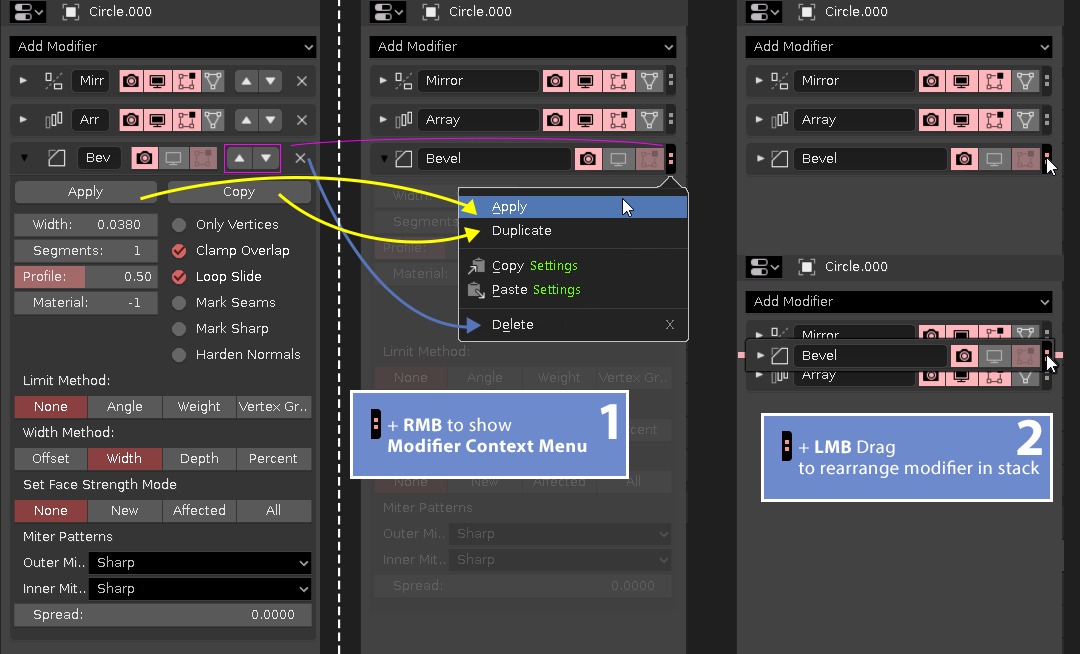
Here is a proposal to enhance readability and usability of modifier header. "Move Up & Down" and Delete cross could be grouped into one context menu button [:] that could be called via RMB on it, moreover LMB and Drag could be used to rearrange modifier in the stack.
Additionally "Apply" and "Copy" buttons (that actually make a modifier duplicate) from modifier "body" could be moved here to show exact modifier content right after header.
[UPDATE] Additional thought (my imho points) :
Q: Why it needs to change classic style of modifiers header?
A: Even in full HD resolution width of the Properties panel is not enough to fit full modifiers names and also there is a whole bunch of buttons in a single row with not all of them used so often to have placed here (vs context menu). I know someone could say - "Modifier icons could help and you no need to see full mod name" but here I personally think it's not so convinient for part of blender users (especially for newcomers).
Actually I have another (imho more convinient) proposal to organaze layout of properties/modifier tab but I'm pretty sure I would be "blamed" or kind of "banned" cause it partially based on 3d**x modifier stack layout.
Maybe my proposal is not ideal but I'm sure that existed modifier area could be improved.
9 Comments
Such basic functionality like "Apply" shouldn't be hidden in a right-click menu, but the drag&drop re-order is needed really a lot.
* @Jan Kadeřábek * That is what I am trying to figure recently but as a lot people from blender are already saying that the modifiers future platform would be in the node system in the far coming months or so. I think this would make sense because modifiers are also useful in animations which requires a ton of modifiers to work with.
* @johnpdelacruz26 * I really hope they will preserve similar modifiers list as nodes occupies to much space for me and will be overkill in many situations
* @Jan Kadeřábek * You got a point. That would also be an issue if a user only prefers this kind of workflow. Aside from the current vertical window for modifiers, I have also proposed a horizontal window for modifiers which will be similar to digital audio workstations. The modifiers will be horizontally placed and you will have the ability to scroll down if the modifier is longer. The difference is you will have the modifiers oriented horizontally and if the number of modifiers will be larger than the window, you can scroll it left to right.
I am not sure but maybe I will create a new request regarding this one and just add some tweaks in contrast to my old post which I have already deleted.
Will you have to open each menu to delete or apply multiple modifiers?
* @johnpdelacruz26 * Maybe dragging a modifier out of the 'stack' (to the left or right) could be used to delete it.
* @johnpdelacruz26 * Yes, in this particular aproach it is so. "Appy All" & "Delete All" buttons could be added on the top row of the whole stack (I think I've seen such functionality in some addon already) but for multiple delete or apply I have no solution here - it could be possible if some kind of checkboxes or (may be color marked) header multi-selection functionality exists and then we could select few modifiers and then buttons text contextually replaced with "Apply All to Apply Selected" and "Delete All to Delete Selected".
* @yunisio * In summary it is a nice idea to start with.
I was thinking something like that.