
Collections Panel: Use Triangles Like Everywhere Else in the UI
In the Collections panel, please consider replacing the plus and minus symbols with the triangles that you are using elsewhere in the UI, and remove the connecting lines.
This will give it a much. more refined, polished look, consistent with all of the other awesome changes being made in 2.8. The current symbols and lines make it look a bit too cluttered.
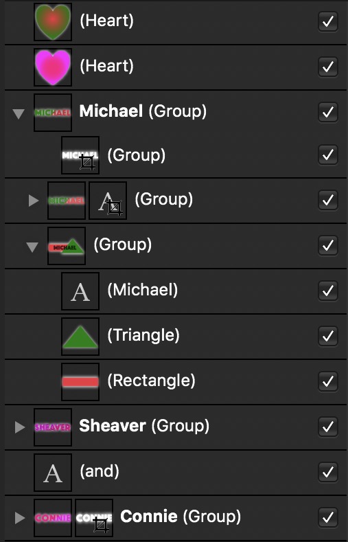
Below is a screenshot from how another awesome program (Affinity Designer) uses the triangle for its layers panel, and it is a much cleaner look (at least to me). The checkboxes on the right determine whether that layer is visible in the editor view.
0 Comments