
Improve visibility of collapsed property sections
Blender 2.8 I have a suggestion for a little and simple improvement on the user interface design. For my example i am on the materials panel. Maybe this could be done other places too.
When i use the Principled BSDF shader (not using node editor) i find all the setting listed downward. Quite a lot of them. Depending on my choises, some can be collapsed.
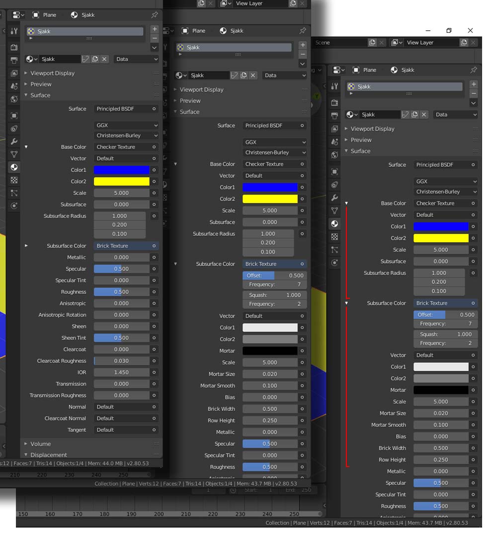
When they are not callapsed, i have nothing to tell me when the settings ends. Maybe a line, or a change in colour could help on this?
Picture explained: My example is on the Subsurface Colour part of the shader. Left part is collapsed. The (too) small triangle tell there is more underneath... OK Center part show the Subsurface Colour expanded out. Right part shows (in red) my ide of telling where each collapsable part ends.
There might be other, better solutions for this. But as it is now, you have to know the nitti gritty details of Blender rather well. And i don't, (yet)
3 Comments
I recommend retitling this to something like "improve visibility of collapsed property sections"
* @David Jeske * Tx. Far better title.
How about a different colour background instead of a red line?
Also, could we see the same with accordion menus? Have the collapsed menus show a basic overview of the main content and have them expand into all their settings when clicked on?