
Improve consistency between Sidebar and Properties panel
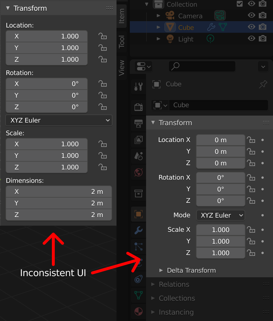
The sidebar (N panel) displays object transform settings in an inconsistent way when compared to the same settings in the object properties panel.
These two panels are similar enough to be expected to work the same way.
- On the sidebar, the "Transform" UI is formatted differently from the Properties panel
- The "Dimensions" fields are missing on the Properties panel
- The "Delta Transform" subpanel is not available on the Sidebar
These inconsistencies cause an additional cognitive overload, because you have to learn how to use them twice.
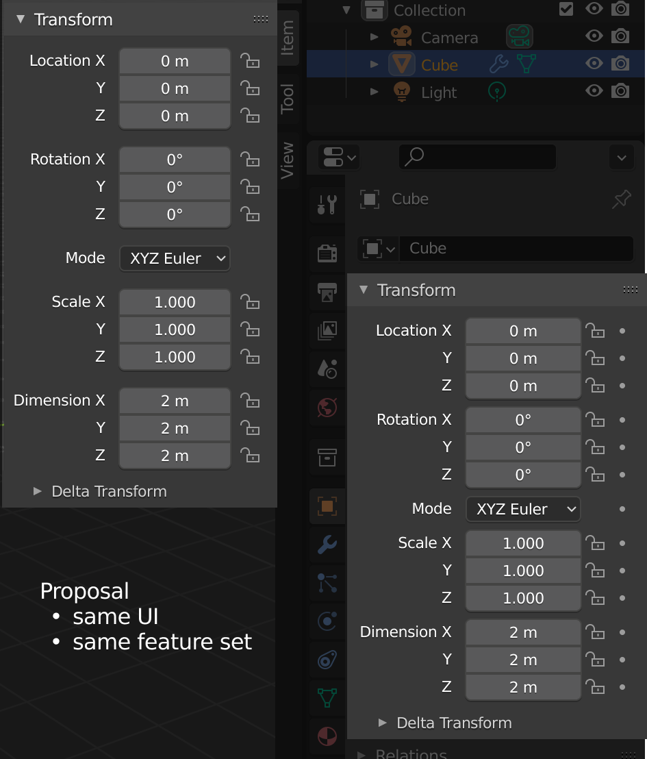
I prepared a mockup with my proposal.
13 Comments
layout of Properties are different because of reasons - it contain lot of things that has to be named and those names has to be readable. Transform on side panel has to be compact enough to not stole too much space from viewport. This proposal made from start based on wrong argument of consistency and ignoring argument of UI composition/usability. Reasons why current UI designed in this way should not be sacrificed in the name of the "CONSISTENCY" god.
Add so much "emptiness" to side panel transforms just because you find some inconsistency... sorry dude, -1
I agree with this. Seems like a case of aesthetics over practicality. I’m all for UI consistency, but I think this is a reasonable sacrifice for compactness.
Your replies and comments are, in my view, invariably correct and helpful, but often somewhat aggressive.
... silence .... I said why I gave -1 (instead of just silently gave it no matter why) and even said "sorry dude" (because I feel really sorry, I dont like to give -1, I do it verry rarely) you find it "somewhat aggressive" ..... could you show me example of similar complain concept, but "not aggressive"? I really curious.
As for the content, I am not sure why some stuff is present ONLY on the sidebar and not on whatever it is related to.
Dimensions are a great example : it's an object's property, yet it just does not apprear anywhere in the object's properties. It is just displayed in the sidebar. Why?
I am less shocked by some properties not appearing in the sidebar, because I consider it as a quick access tool. Something that allows me to have access to essential properties of my tools and objects without the need to fiddle around the properties editor.
So not having something I don't often use like Delta Transforms is fine, but it is partially because I know I can get access to this on the object's properties anyway.
In fact I wish the sidebar was customizable. If the user could chose what's in there, that would be a bless.
As for the layout itself, I am not sure which one is the best. It's like you can get up to half width but with 4/3 of height.
Is it better to have less scrolling or less viewport hovering ? It depends I guess...
For reflexion some option to move rest of option functions to tool as "turn on on tool" or by drag&drag. I think that tools is "quick" access for basic settings to operate. Hvr.. can do dissonance if user more often tool than options dock (I meet this).
As much as I agree with FG on the proposal, I very much agree with you Richard on his attitude. His comment here is not a great example, but I've seen him shoot down new users or make people feel dumb far too often.
FG, you're a valued member with some good ideas but you've got to stop with the abrasion. Learn some humility and treat ALL users with respect. I don't care how "dumb" someone's idea is, no-one is deserving of the vitriol I've seen you dish out.
I suspect there's a bit of a language barrier going on. The broken English used in the first reply is the biggest clue. Not saying he shouldn't be more careful about how he speaks, but sometimes when people have trouble with a particular language, it can appear rude or insensitive.
So you didn't care at all of my argument why this proposal are wrong, you have nothing to say about it, you care more of my broken English and my rudeness something?
FG, I think it's pretty clear where you stand, English or not. You called a new user a "loser" for making a duplicate proposal. There's plenty more where this came from. Also, you managed to annoy Pablo himself.
Fix up your attitude. It's not good enough, and it's not helping people contribute their ideas. People are bringing it up here because we're sick of it and see it too often.
About "losers" and duplicates - never I had called anyone like this, what I did is reply such cases as "here, check this, next time use search before writing". I will keep doing this because it show that people don't care of this place, of what is going on here, of what already proposed, they don't even try... and this is wrong, not me.
To say "of course search function for losers" and show that proposed already exist (it need to just use search a bit) and call author as loser is two wayyyyyy different things. Don't you find?
About my "thank you" - my "thank you" is silent heart under his comment and Pablo knew it because notification system notify about hearts (or not because he have too much of notifications). I don't find loud and showy thanking for fixing things that just has to work as right behavior.
Now you show me what - my another remind that issue with notification has to be fixed as well. You find it agressive, wrong or whatever ,I guess. You know what most ironic in this circumstances? Is that I know now about this Pablo reply only from your screenshot because RCS notification system didn't notify me about it. This notification issue is critical, it just broke communications between people. It has to be fixed if this place has to be for people communicate and discuss things, otherwise this whole place is same broken.
About people doing something for free. This image on my imgur uploaded 2 years ago. I had posted this image somewhere in comments where we another time discussed RCS issues and why those RCS issues can't be "just fixed" because "we do it for free in free time". As you see on image menu has
$ Donate
. I had proposed to add separate donation for people who maintain RCS, to make things work not "for free when they have good mood and free time" but for money.
I was one who was about to pay money to keep things work here. Two years ago. Answer was silence...
Next time, before you accuse someone of something, think twice and do not make yourself a righteous person who teach others how to live.
This garbage can be summarized to “the users are idiots, and I shouldn’t be blamed for calling them what they are”, which I think tells everyone enough about you. You’ve been here a while so you figure the way you treat people is justified. That's pretty messed up.
Please, save us from your self-infatuation over ALMOST implementing a donate button. Also, justifying your rudeness towards Pablo is probably not the smartest thing to do.
Get over yourself FG. Myself and many others will be here to report you when you step out of line. You can live how you want, but the rest of us have a right not to put up with it.
Sorry, I missed your answer. Nice arguments! Indeed, your writing style seems a little aggressive but I'm sure you do not intend that. Anyway, pointing out some important things:
your image shows valid points. however, it ignores two things:
This proposal also includes the addition of the "dimensions" segment to the properties panel, which I'd find really useful, and the "delta transform" subpanel to the sidebar.