
Custom properties panel Ui enhancements
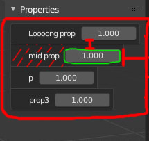
Custom properties panel has different Ui type from standard properties. the name is separated from the slider and caused the sliders to be shorter than other sliders. also the border box around each property takes a lot of space. in 2.8 there is also alignment mismatch... custom properties should look like other standard props to have the same usability

4 Comments
overstreching Edit button: {attachment 7975540jpg}
pinching field. Sort of correct idea: left more space for value and name and decrease spaces {attachment 7963340jpg}
Hmm… With different situations it can look better or worse. {attachment 7924618jpg}
So 1. Names should be aligned on left. It make visual search easier. No doubts. Digits… If they will be aligned to far right it is bad. If they will be aligned to the rigth but colum aligned by longest name — not bad. Also zebra. Without zebra row-search easier. Like this: {attachment 7933331jpg}
* @ Vyacheslav * it should look and behave like standard properties in any situation. long name will not cause problem because the block fits the panel width and can be changed by hand... aligned properties enables user to click-drag to select multiple sliders and change them at the same time. Wide sliders also make animate easier.
seems like a bug in the UI