
Vertical Tabs for Outliner
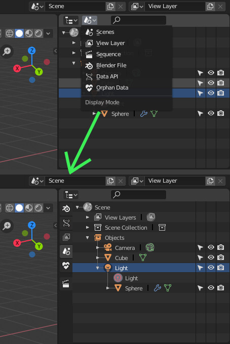
Exposing Outliner's Display Modes as tabs would make them more discoverable.
It would ease switching from Scenes mode to View Layer mode.
Current list does not display Mode name. Space freed by removing the list from header could be filled by name of active mode.
9 Comments
If outliner tabs would be a thing i would prefer them to be horizontal, cause outliner is usually very tall and quite narrow, so tabs would eat up a lot of space that would be unused.
* @Pawel Piotrowski * Horizontal tabs are annoying for narrow editors, too. That's the reason why they are vertical for Properties Editor in 2.8.
Because outliner is narrow in current default workspace, Display mode name is not displayed.
I think that is not annoying to discover the tabs vertically inside current default workspaces that are not tall.
Then, when user knows they exist, he could hide them like tabs of Properties Editor in his custom workspace and only reveal them when needed or use shortcuts.
But maybe you are talking about changing outliner editor to support an header with two rows. One row for tabs and another one for filters. That may work very well, too.
* @Pawel Piotrowski * exactly, and the other display modes are not that important so that it takes another row of UI space and ultimately crowding visually the outliner
* @Orphydian * I disagree about the importance of these views.
New users of blender think that they are into an equivalent to Scenes View. But by default, they are using View Layer View. That is important to know that purging data of your file requires Purge button of Orphan Data view. That linked data are easier to manage with Blender File view. Data API may help to investigate and solve problems.
With a good asset browser, Sequences view is not really needed. But except this one, all the other views are really important and used while dealing with complex files and big projects.
* @Pawel Piotrowski * You do know those tabs are collapsible, no? If you don't use it much, you just can collapse it and it stays the same as before. And if you use it a lot, is faster and more discoverable than having to go into a dropdown within the header.
BTW You can keymap mode switching
Or cycle value by hovering mouse and Ctrl+scrolling:
* @Pawel Piotrowski * +1 for shortcuts relative to outliner UI (modes or filters). The idea was also to mimic Properties tabs shortcuts (Ctrl Tab, Shift Ctrl Tab).
In my opinion those drop down menus are nice, like the the ones in the top of the viewport but there are times that the drop down menus can hinder familiarity in some of the other features of Blender.
The node system may also benefit from these kind of tweaking, like putting them in the properties tab (Hotkey T) aside from being accessible in the Shift+A Hotkey. The side bars being still, makes you study all the locations of the nodes at once compared to the Shift+A Hotkey where the other drop down will close if you switch to the other groups of nodes.
for another icons like the Scene mode to be viewable aside, there is no reasonable way to add an entire another vertical space to the UI. Just no. Other modes are marginal sorry. Probbaly people want the same thing replicated from 3ds max which is kinda shallow thats why this is so popular.