
Blender VSE - UI / UX Suggestions
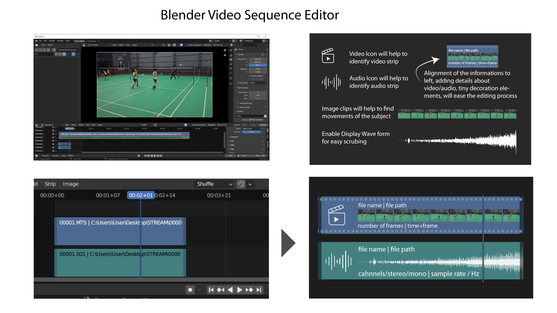
It's not easy to remember color codes to identify the type of strips. I have added Icons, tiny decoration elements to ease the visual identification.
"Number of frames" is now displayed after the 'file name' and 'path'. Most of the time its hidden for the user. If it is alaigned to the 'Left Bottom' corner will be geart help.
Adding strip length in time+frame format (eg: 02:10+7) will help user to speed up the editing process.
Adding Image clips in the Video, and Enabling Wave in audio by default will help ease the scrubbing.
Including Channels, Sample rate at 'Left Bottom' of audio strip will save time for the editor.
Suggestion screenshot attached.
4 Comments
I suggest looking at something like Clipchamp. It is a software that is more for casual use, not so feature focused like Premiere or Resolve and in terms of user skillset and usage, more similar to Blender IMO.
You can find the timeline really simplified, dynamic
You know in the dropdown to the right of the sequencer header, you can checkmark the data you want to see(and uncheck the stuff you do not want to) on the strips. The rest of the data you're asking for is located in the bottom of the Time/Source panel.
In the top left of the panel for the active strip, an icon for that strip type is exposed.
The waveform is not on as default, because it can take several minutes to render, currently. However, a Gsoc participant is right now finishing a patch which hopefully will speed up the rendering, and when/if that is implemented, and they're fast enough, they properly could be on by default. Same reason for Thumbnails not being on as default setting.
It is a matter of taste if you want all data exposed on the individual strips. For me, it feels cluttered with icons and excessive text on the strips, so I would prefer that everything, except the strip name, lived in the source/time panel.
You don't need icons for video and audio, it's obvious which one is which without them. And you don't need to make the video to look like celluloid film either, minimalism ftw.
I love the idea and the solutions proposed, except the icons: they take a lot of place that could be used by the thumbnails and waveforms.
Maybe they should be just a little icon in the top left corner, hovering the rest. Or not there altogether, as the film holes + color + thumbnails + waveform might be already enough.