
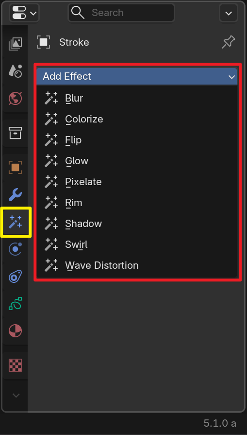
I suggest designing easily distinguishable exclusive icons for the "Effects" function of "Crayon Stroke".
I suggest designing different exclusive icons for the "effect properties" in "Crayon Stroke"—currently, the icons for these properties are exactly the same, which I think is unreasonable. Designing differentiated icons will not only make each property more recognizable but also enhance the overall aesthetic appeal.
6 Comments
Unreasonable 😆? I mean , these are kind of like make shift compositing effects for GP. Because it ran on it's own render engine. Not really modifiers that have wider effects that interact with each other.
Also i feel like there have been talks to replace it with geometry nodes since the version 3 rewrite, and compatible with G-nodes was added. So The effects tab might just be a place keeper.
i can't even really think of good , general icons for each of these effects that let you understand what they do at first glance.
From a user's perspective, I find this quite odd—obviously different functions adopt the same icon. At the very least, there has never been a case in this software where "different functions share identical icons." Additionally, are you saying these are temporary icons? Or is there simply no need to design distinct icons for them? This is just an open discussion. However, personally, it is really strange that the same icon is designed for different functions.
Yeah , because of how Gp has been developed , they had done a few things that were temporary , but then they re-wrote GP from the ground up and then were going to integrate it into Evee and remove the grease pencil render engine. Though that fell through for now, they still added Geonode support. So i think to a degree things that were temporary, ended up being temporary longer.
Personally , i get what you are saying , but effects were always a special Gp thing to fix it's limitations. Like Needing specific compositing effects but not running in a engine that supported it. And each Effect has a very singular function. Each effect doesn't mix with other effects to cause different outcomes. like modifiers tend to do. The names describe what every effect does. So i never thought it needed different icons. I just never noticed until i saw your post.
I’m not quite sure about the development priorities of this software—does it prioritize stability, or does it pursue innovation? Or is it because of the low responsiveness to user feedback that many longstanding issues remain unresolved? In fact, since I submitted this feedback, the development team has not provided any response at all—could it be selective neglect? However, regardless of whether my feedback is effective or necessary, my core request remains unchanged: unlike some other 3D software, it should not use the same icon for different functions. In my opinion, an intuitive and stable software is truly suitable for integrating into daily work processes.
Ehh , probably a bit of both. Stability a bit more. Also they don't have a ton of devs, Or donations to hire more devs. They're always scrambling to make sure everything is as bug free as possible.
But i feel like other companies with paid software don't take feedback at all.. And they can't just take every feedback from everyone and just throw it in.
In general i don't think they tend to respond much to "Feature Requests." Which is what this site is for. They SEE the request though. I think they see them and just add them to a list of "users wants." Also things with more votes, get's seen more. Just the nature of a voting system i guess.
If you have feedback , they take it in other places developer.blender.org/docs/handbook/communication/user_feedback/
Understandably, but the rationality and stability of the software still need to be focused on and enhanced—only in this way can more users be retained, and thus enable studios or enterprises to apply it more professionally in their work at an earlier date.