
Bevel Modifier. UI Fix.
Bevel modifier's new features are very cool. But the new UI is very uncomfortable, frequently used buttons are scattered all over modifier.
I suggest changing UI modifier, and make it more convenient to use.
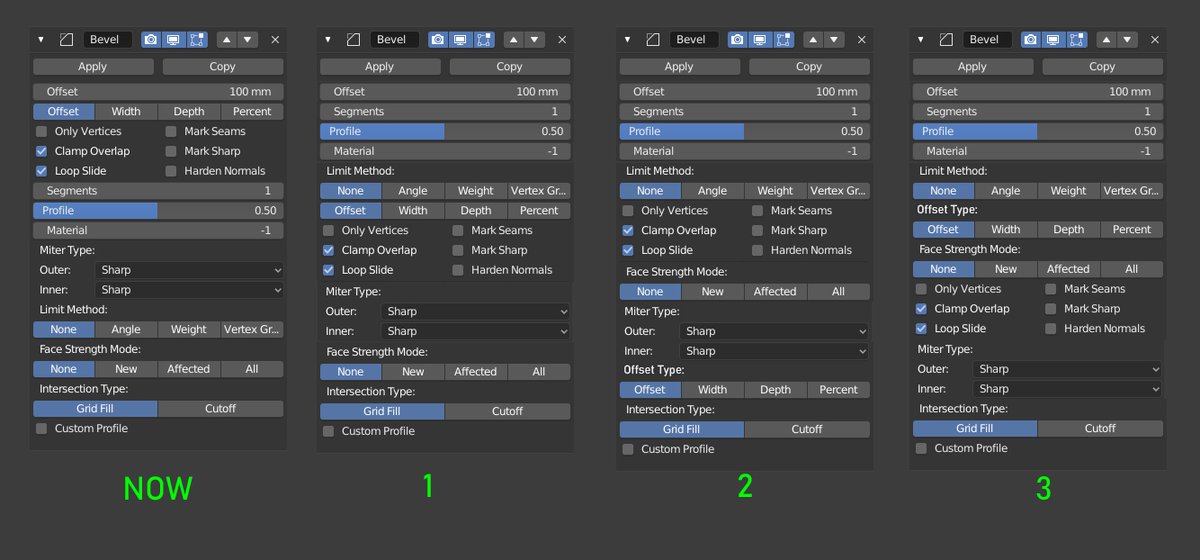
Personally, I like the 3rd option
Here I was guided by 3 principles:
- Lift all frequently used functions up and combine
- Combine functions by similar types
- Combine functions that do the same job.
But this is based only on my personal experience. Sorry for my English


7 Comments
With Advanced option
It's not just your experience. I wholeheartedly agree. It should be reorganized. I made changes in my UI colors for the very reason to make it easier to identify the more important options of modifiers. I'm constantly lost in their UI.
And Emir is also right, some of this should be hidden in options to not make the modifier so tall in the stack.
"Advanced" button could be implemented to toggle on/off to reveal lesser used options.
I like how you think.
I like Proposal #3 also, looks more organized.
It looks best in option 3, I agree. One further suggestion: shouldn't "Offset"and "Offset type" be next to each other as they pertain to the same concept?
* @Ivo * I updated the proposal text and explained why I chose this UI.