
Outliner: Display only inactive icons
Problem
The new Outliner icons may add some visual noise when many items are shown on screen, presenting more information than usually nedeed.

Solution
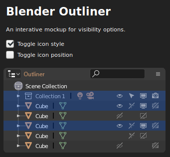
Hide everything and only display icons in the inactive state, that is, when they are in use. But also show all icons for an Outline entry when it's mouse over or selected.

Discussion
This solution raises issues for some users. The
empty space
between visible icons creates a misaligned feel. In response to the that, we can align the icons to the right.
 But that creates an even bigger problem, that's the icon changing their position during interaction, possibly leading to missed clicks. To avoid that, and to favour muscle memory, I'd rather stick to fixed position icons.
**
Another issue is that the current design of inactive icons doesn't communicate very well its "inactive" nature alone. Without the surrounding counterparts, it's hard to tell if the "render" icon, in its inactive state, is telling the user that that object is gonna be rendered or not.
I would like to suggest the use of a dash over the original design to empathize the "not". I think it improves usability at cost of a less clean design.

Try it yourself
I've also created an interactive html/css page on
Codepen
(from where I took these screencasts). You can click and interact with it, and also toggle icon style and position and see which works better:

Conclusion
So my suggestions here are to hide the Outliner icons by default, to show on mouse over or item selection, keep a fixed position, and change the inactive design to dashed versions.
These ideas are not originally mine. I saw them spread on BA on different occasions, so I don't know exactly who to give credit. My part here was to condense and elaborate over them. I hope it helps the discussion. Please let me know what you think about it.
14 Comments
Greate idea. Just one thing, how would you handle truncations like in the image?
@Allosteric: Great question! I guess we could do the same as in the image, hovering the icons with a solid background over the row. The icons should not move with horizontal scrolling, and stay always aligned close to the right.
+++++++++ pls, Pablo ,make it , pls ))
Maybe, the ‘hidden’ icons could be represented by a small dot. This restores the alignment. Also, i’m not a fan of the dash for the visual noise it introduces. Still, a good overall proposal.
Only issue is the first initial mouse over - where? You need a header label to show where you can click and drag to high and unhide without the need to mouseover. But in general I like the concept, you just need a visual index (column lines maybe?)
@ondraise15: The mouse over is trigged on the entire row for each item. As soon as the user hovers an object name, the options are shown. They are also shown for the current selected object, and as Blender starts with a cube pre selected, I think it works as an initial reference for possible interaction.
A solution for right aligned icons would be to trigger fixed alignment when hovering.
@hivefive: If you mean when hovering the row, that's how it's done here. I thought about fixing position for all items when hovering the Outliner itself, and even that helps endeed, I don't think it's a complete solution. The problem seems to be that when the user looks to the icon and prepares to take action, its mouse is not hovering that particular icon row, and most times nor the Outliner. So he/she usually sees the icon in a different place when the mouse movement starts, than it's gonna be during the actual interaction.
@Paulo José Oliveira Amaro: My scenario is that when the user moves the mouse in the right side of the outliner (basically the whole space taken right now by the icons), that should trigger the icons to align, and any hidden icon should become visible (on or off states), not only those on the row under the mouse.
Shut up and take my upvotes!
Well done! Also great presentation of the proposal. Agree with fixed position, it makes vertical scroll possible for multiple hiding/unhiding. One more thing: less space between those restriction icons
I really like this proposal ;)
i wish i could upvote more than once.. the giant wall of identical icons really bugs me given how much improvement there has been in the UI lately
Sorry of OT, I don't know if you've seen this post on your 3 years old vse panel redesign post here at RCS: Hi Paulo, I've noticed you're back on the community. Guess what we're a bunch of people still trying to redesign the VSE. We found out that we actually can customize not only the UI but also the functions of the VSE through python. And we have worked our way through the menus. There is some interest from the Blender Devs.(especially from the Blender dev/director Pablo V.) for our work and it may find it's way into Blender.
But the sidebar really also need a redesign and you have shared here so many wonderful ideas, however, now it is supposed to be one column like the new panels in the Preferences or the other sidebars.
If you like, we could really use your help rework that messy vse panel or anything else to improve the vse?
There is a thread on some of the thoughts here:
devtalk.blender.org/t/can-we-in-collaboration-produce-a-working-suggestion-for-improving-the-user-interface-of-the-vse/3264/50
And we discuss the developments of the vse here:
blender.chat/channel/vse
You can download and try the reworked vse menus here:
github.com/tin2tin/blender_vse_reworked