
Right-Click Select logo
I hope I won't offend anyone by saying that the current logo, while being functional (in that it illustrates the name of the website and uses the Blender color scheme) isn't otherwise that pretty. Now that the website got a big refreshment and that this whole blender.community is out, it would be cool to refresh the logo as well.
At least the dropped shadow should be dimmed. Here its current opacity is halved (left), next to the original (right) :


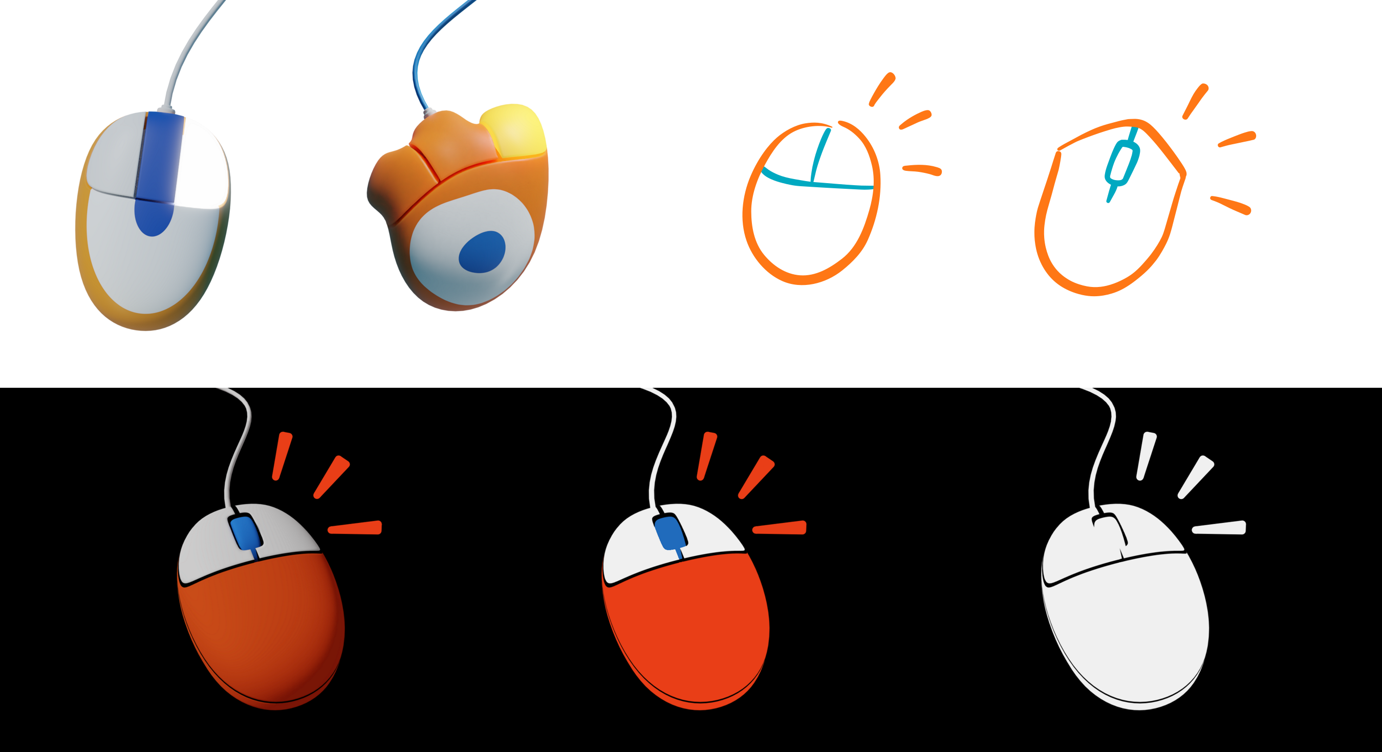
But at most, how about making a new one ? Here are some quick concepts I made and some explanations in the comments :
18 Comments
On the whole, I don't disagree about the general lackluster aesthetic of the current logo. However, I still believe that the logo should be more graphical than pictorial. That is, it should be a logo... an iconographic symbol that would work with only one or two flat colors. I also think it should hint at Blender, but I very much want to avoid using the Blender logo itself as part of the design.
@Jason van Gumster: I see. May I ask why it's important for it to be flat while it's not for blender.today and why it shouldn't look too close to the blender logo (like my blenmouse) ?
@Caetano Veyssières: The flatness just relates to my own sense of design. The rationality is that simple shapes with strong silhouettes are easier to recognize and remember. The strong silhouette part is the key for me. That's easiest to achieve with flats... but of course, not the only way.
And I don't think it should look like the Blender logo because although this community is about trying to improve Blender, it is independent. RCS is in no way directly affiliated with the Blender Foundation. Including the Blender logo or looking to similar to the Blender logo would do more to confuse folks than help.
@Jason van Gumster: I prefer flat design also. But I would remove the middle button from the logo (it does not indicate anything in the idea) Also I would remove the drop shadow. In logo design, the simplicity is the most important idea. I've designed quite a few commercial logos.
Those 3D renders are nice illustrations, but it would be a nightmare to use them as a logo. where you would need to use the same design as a complete black or white or negative etc. Also, try to use it in very small size. Those would work as an illustration if RCS would, for example, do an animation or a brochure of their website.
@Artturi Mäntysaari: That said, my version would be like this i.imgur.com/nWCgKQC.png Or with different colors.
I like your concept, @Artturi . I'm hesitant to pull the middle mouse button because although you're correct that it doesn't necessarily indicate anything in the idea, the middle mouse button is [currently] of critical use in Blender. I'll probably test a version with perhaps a scrollwheel... but the more I think about it (as I write this), the more I think you're probably right.
I'll let this stew in my head for a bit. :)
@Jason van Gumster: I'll make some other concepts myself but I need to give my opinion first :
To me there are 3 ways a logo can be truly recognizable. It has to be either organic or fairly complex or somewhat 3D. If it's none of that, it's a road sign.
All of that said, it's no big deal, after all it's just rightclickselect. I was mainly throwing an idea to kill time.
@Caetano Veyssières: To the contrary, for RCS to be the destination for Blender users to share their ideas, it must be recognizable. Simplicity---and especially a strong silhouette---is still the fastest route there. Signs and symbols are powerful because they are simple. That's also why some of the most effective logos are all largely simple and flat. Look again at the list of you've made... check their websites. The logos for Maya and 3DCoat are both flat with strong silhouettes (though Maya is pretty boring as just an M). Cinema4D has a 3D logo, but it's largely forgettable... a 3D sphere thing. The logo for its parent company is just text and it's far more memorable.
Everything else you've mentioned is largely an issue of personal taste. If there's a logo design for RCS that has a sense of depth to it while still retaining a strong silhouette, I'm certainly willing to consider it.
@Jason van Gumster:
I can't say I agree with everything you wrote but getting into it would be picky and not very necessary.
Anywho, more concepts and their explanation :
like this : </br> </br>
You get the idea (haha).</br></br>
It's also tipping to the right to give it dissymmetry which I find a bit more interesting, plus it's
Right
-Click Select.</br></br></br>
</br>
You get the idea (haha).</br></br>
It's also tipping to the right to give it dissymmetry which I find a bit more interesting, plus it's
Right
-Click Select.</br></br></br>
@Caetano Veyssières: These fit a bit more closely. I think the sketchy versions tend to fit a little bit better. I understand the logic behind the action lines, but I'm not entirely sold on them yet (though I am warming up to the concept). If I can find the time, I might try a variation that's a bit of a mash-up between your sketchy aesthetic with @Artturi's color arrangement.
@Craig Jones: Plus I'm realizing the first sketchy one is kind of sexually suggestive. Not much but enough to bother me.
I would really include a wire personally, though.
Another idea is that it could also be more polygonal. Like, still a bit chaotic but with straight lines, like a low-poly mouse sketch/model/thingy. I have to try.
Ok here are some low-poly concepts :
@Caetano Veyssières: * I like these new ones a lot. Looks very graphical and simple enough, so I bet some of these could probably work as a logo or some edited version of these. Anyways, polygon is a very popular graphical style atm on graphics works.
@jason can you tell me what you think ? Earlier you were talking about trying a mashup between a sketch and Artturi's design. I don't know what you imagine exactly, so I'd like to see it.
@Caetano Veyssières: Haven't had a chance to address it recently. I'll see if I can set aside some time soon.
This is a test comment.